Style Sense: Summer Chic in Antique Cream and Pink Roses

Introduction

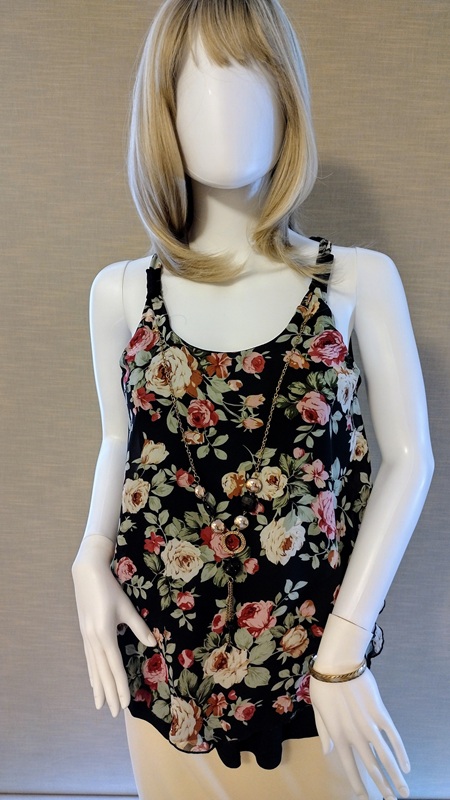
The styling exercise this week builds on the outfit featured in last week’s posting, Summer Chic: Vanilla Creme. The top is made from fabric featuring a pattern of roses against a black background. When the top of an outfit is a darker color than the bottom, consideration should be given about keeping all elements of the outfit in balance. I will share with you the decisions I made to keep the top as the focal point of this outfit.

Summer Chic: Antique Cream and Pink Roses

I wanted to draw the eye to the pretty floral print of the top and keep the focus there. The top has a necklace attached. It adds additional visual interest and focus. To draw the eye to the top it was important to use the tan colored sandals with the vanilla colored skirt. If black sandals were used to accessorize this outfit the eye would then move between the top and the sandals because of the strong difference to the lighter colors in the outfit.

I wanted the contrast between the top and the skirt to be effortless. The print fabric features roses in shades of antique cream and soft pink-red. The antique cream roses harmonize with the color of the skirt. Although this outfit looks like a set, it is not. The top was bought over 10 years ago! Since the top and skirt are basics and the colors classics the outfit works well for summer in any year. This is why I always encourage others to stay true to their style preferences and shop with timeless elegance and quality in mind.

Summary

To achieve balance between a dark colored top and a light colored bottom for an outfit:

–Keep the shoes and bottom garment the same or similar neutral hue.

–Select a color for the top that works in harmony with the netural hue. Make sure the color is not too strong. Otherwise the outfit will lack an element of balance.

–When the top is made of printed fabric find one color in the print that has is close to the neutral shade of the bottom.

Combining Minimalism and Vintage to Style a LBD

Introduction

For this styling exercise I wanted to apply the principles of Minumalism. Here are a few key elements of Minamulism in design and styling:

* Clothing is well fitting.
* Neutral shades predominate.
* Classic styling with minimal details.
* High quality fabrics and notions.
* Form follows function. There must be a purpose to every part of the garment. This results in fewer frills and non-essential details.
* Accessories must be carefully chosen and contribute to a refined look.

I started with my favorite Little Black Dress (LBD).

LBD Details

I bought this LBD at a small boutique on Fifth Avenue in Bay Ridge, Brooklyn. A sewista with mid-level skills will be able to analyze the style lines and understand how the fit is achieved. This LBD skims the body but is not form fitting. Fit is achieved through vertical princess seaming from shoulder to hem on each side of center front and center back. The princess seams intersect with the bust dart and vertical dart on the front of the basic sheath dress pattern. They also go through where the shoulder dart and vertical dart on the back basic pattern are.

There are two layers to the butterfly sleeves. Each layer is lined with a lightweight black satin. The dress is also lined with the same material. This helps the dress fit smoothly over the body. My challenge was to find one accessory that adds visual interest and works as a definitive focal point for the outfit. Determing the focal point is a skill developed through practice. My ability in this area is still developing.

The Focal Point for the LBD

I decided there could be two different focal points. Which one I would apply depended on the occassion.
Styling #1

The fluttery butterfly sleeves reminded me of similar sleeves on dresses and blouses of the 1930s. I wanted to add a combination of retro Art Deco and Modern Minimalism in the choice of the accessory to define the focal point.

I selected a wide elastic band belt with a triangular mock Marcasite belt. The sparkling belt buckle creates a striking contrast against the black dress. The width of the belt works well to create a more fitted look. The width of the belt is just right since it keeps the eye focused on the waist area. This is where I wanted the focal point to be.

Styling #2

For a different look, I removed the belt and considered accessories that create a different impact and vocal point. These accessories provide some interest but keep the eye focused on the fit and flow of the LBD. I chose costume jewelry in the form of a mock cubic zirconia ring set. The purse has a mock marcasite closure that also carries a little feeling of Art Deco. It may be used as a clutch. It also comes with silver chains with clasps that connect with loops that swivel up from the inside of the purse. For a little added sophistication, a silvery rhinestone perfume atomizer or lipstick case can add further interest to the purse as a focal point.

Conclusion

It is possible to combine the principles of timelessness and simplicity of Minimalism with one or two elements of vintage fashion. Practice and experimentation will help develop the sensibilities needed.

1930s Skirt and Blouse: Finding the Focal Point

Introduction

This week I reviewed the first sketch made for my next project, a 1930s inspired skirt and blouse. I do not have much experience working with styles of this decade, so it is a big challenge for me. I have only made one dress using design elements from a 1930s book, Paris Frocks at Home. That dress was designed as what I envisioned a woman would have as a special occasion dress during the Great Depression. It was pretty enough for a semi-formal occasion and yet could be worn for more everyday events such as a Sunday visit.

With my new project I am envisioning how a woman would dress for work during the 1930s. I want the skirt and blouse to be pretty and attractive enough to be wearable for today. For this reason I am taking only certain elements from the 1930s, not all of them.

I re-thought the first sketch and was not satisfied with it. I will detail the reasons here while sharing the importance of maintaining a clear focal point for any design.

What is a focal point?

A focal point is that part of the outfit where you want to:

–direct the gaze of the viewer
–emphasize a feature and make it attractive
–express an idea about the outfit, i.e. what is the message

Importance of integrating a focal point into the flow of the design

A focal point must be in harmony with the overall appearance and purpose of the outfit. It has to have pleasing proportions and add to the wearers attractiveness. Learning how to balance focal points takes experience. You want at least one, perhaps two. But never so many that the eye does not rest on any particular area and then move to what feature you are emphasizing. For example, in Version 1 of the 1930s outfit there are, I think, conflicting focal points. The scalloped yoke of the skirt competes with the bow of the blouse.

Version no. 2 of the skirt and blouse appears more calm and pleasing to the eye. The flounce at the bottom of the skirt emphasizes the movement when the wearer walks. A second focal point is the v-neckline of the Peter Pan flat collar. A small, marcasite Art Deco broach can be pinned at the neckline to create a second focal point. Or, very pretty but small buttons may be used to create the second focal point. Here there is a more sublte play between the focal points that Version no. 1 lacks.

How to compare focal points and choose the right combinations

One way to choose the right combination of focal points, or choose to have just one focal point, is to make separate sketches of the parts of the outfit. Then make a complete sketch of the outfit put together.

1930s skirt and blouse sketches and notes, Version no. 1

1930s skirt and blouse sketches and notes, Version no. 2.

If doubts remain about the current pairing of separate parts of the outfit, the sketches of the garment pieces can be mixed and matched. This gives some idea on how the elements might or might not work together in a different combination.

Blouse Ver. no. 2 is paired with Skirt Ver. no. 1 on the left. On the right Blouse Ver. no 1 is paired with Skirt Ver. no. 2.

It helps if the sketches are put aside for a day or two. Then they can be reviewed again with a fresh point of view. When performing this review, be aware of what first captures your attention. Then consider how that first focal point works with other elements in the design.

Through this process of sketching, considering, studying and planning you will come up with an important and clear definition of how to proceed in the next steps of your design plans.

My final choice: Version no. 2

Additional Resources

To learn more about focal points in fashion please visit:

UEN Utah Education Network
Emphasis_the_Focal_Point_of_Fashion_1_.pdf
Scroll down and on the right side of the screen are free course materials you can download that will help you understand what the focal point is about.

Purfe: Fashion, design and perfect fit
“Basic Principles of an Outfit Layout: Focal Point”
October 14, 2012
by Olga