Featured

Why My Patterns Have a New Home at WordPress: A Statement on Community, Ethics, and Accessibility

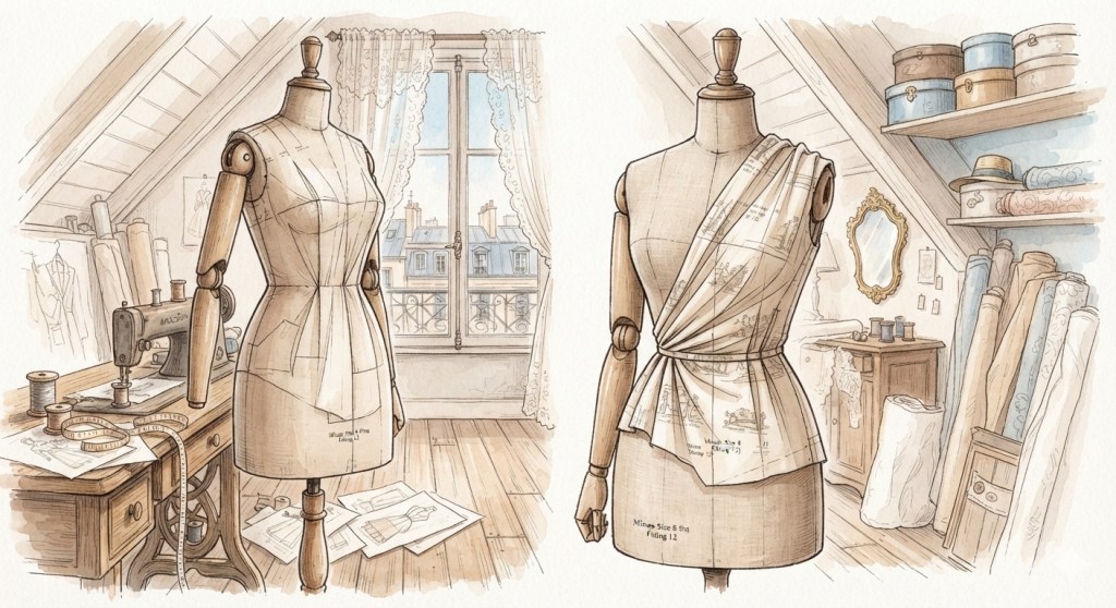
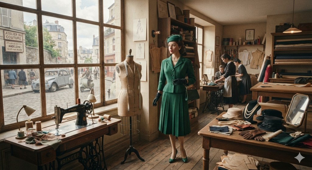
A 1950s Parisian dressmaker's atelier in a sunlit attic room. A stylish schoolgirl's outfit is displayed on a dress form next to a 1950 model Singer sewing machine in a cherrywood cabinet by the window. An old-fashioned treadle sewing machine is set against the left wall, with a pattern-filled table and shelving units holding sewing supplies nearby.

Illustration: My collaboration with Gemini and Nano Banana.

Free Pattern Downloads for All

I have decided to bring my original pattern booklets permanently to my WordPress blog for free download under a Creative Commons copyright license.

For anyone downloading these booklets, you will see a notice on the very first pages. By downloading my work, you agree to abide by this Creative Commons license. It is an honor code all the way through—a commitment to giving back to the craft. This framework provides you with immense latitude and room for your own creativity, while ensuring the foundation of the work remains respected.

Going forward, all of my pattern releases will be packaged into comprehensive booklets featuring full instructions, encouragement, affirmations, and a brief history of the garment.

Understanding the Format: A Resource for Savvy Makers

It is important to understand that these are not commercial, mass-market sewing patterns. You do not send these files to a print shop. Instead, these are photographs of my original, hand-drafted patterns laid out on a 1-inch grid cutting mat.

These are the original photos taken with a cell phone camera and uploaded directly. They are completely untouched and are not altered in any way. It is entirely up to those with Adobe Illustrator or standard graphics editor experience to make their own adjustments, scaling, and digital cleanups. Most importantly, every single one of these patterns has been meticulously tested and fitted on a professional dress form before release. Once you download that image, use the 1-inch grid guide to scale it to 100% true size, and begin tweaking it, that pattern becomes yours. You are putting in the work.

That is the true definition of community and open source. The design will evolve as fellow makers refine it, alter it, and change it to suit their needs. It is no longer just my pattern—it belongs to everyone who uses it.

Why This Move Was Necessary

Recently, I attempted to share my original resources on a massive public repository in good faith. My goal was simply to donate these high-fashion, industrial Wolf-form blueprints to the global creative community.

Unfortunately, the experience was deeply disappointing. Instead of being welcomed, my professional work was summarily and preemptively flagged for deletion. The platform’s rigid, automated system and narrow gatekeeping demographic dismissed the material out-of-hand without checking my transparency statements or examining the raw photographs of my physical cutting mat.

Because of this exclusionary culture—and a stark lack of diversity among the platform’s administrators—I have officially requested the permanent deletion and withdrawal of all my files from their site. I choose to stand in good company and will not donate my decades of professional training to a platform hardwired to alienate creators.

My Resourceful Workflow and Ethical Tech Use

I want to be entirely transparent about my creative workflow, as discussions around technology are highly pertinent to modern artists. I am working on a limited budget, and in order to expedite the distribution of my patterns, I use what is readily available to me: my cutting mat with a 1-inch grid and my cell phone camera.

Because I cannot afford a professional studio or a photographer, I photograph my dress forms in my living room during the fitting process and upon completion. My home environment does not have optimal studio lighting. To resolve this for the instructional imagery showing the finished garment or the toile as it is being fitted, I use AI tools ethically only to refine the background environment.

The garment itself is entirely untouched. The drape, the hang, the fit, and the way the fabric looks are 100% authentic and completely unaltered. The technology is used strictly as a digital cleaning tool for the surrounding room, which is the most expedient way to create clean, professional resources while ensuring the final file sizes are not too large to distribute online.

Furthermore, due to physical challenges and chronic tendonitis flare-ups, collaborating with assistive digital editors allows me to bring my dictated text to life without overextending my body. I work slowly and mindfully on the days I am physically able. To summarily dismiss original, hand-drafted intellectual property simply because a creator utilizes modern adaptive tools is a form of systemic exclusion that alienates contributors with physical limitations. Good-faith work should be evaluated on its structural validity and original intent, rather than being rejected due to a lack of understanding regarding accessible creation methods.

Those who are savvy and understand the workflow of ethical AI use will embrace this method, recognize the precision of the underlying work, and make it their own. I refuse to be part of the current witch hunt or blanket condemnation of these tools. When used ethically to support human artistry and accessibility, they are invaluable. It is no different from a traditional author collaborating with a human editor to refine and reshape their drafts.

At the same time, I believe deeply in a balanced life. The next generation must be grounded in critical thinking and rich, real-world experiences completely outside of a computer screen. True progress means building a culture that welcomes these balanced, accessible workflows rather than reacting with fear and summary dismissal.

Leaving a Legacy

There is absolutely no money exchanged here. This move is driven entirely by my desire to leave a meaningful legacy. I want to provide a door of opportunity to those who love the art of dressmaking but may have limited financial means to access original, high-fashion drafting resources.

By keeping this space entirely self-service, I am giving you the raw materials—it is up to you to apply your own skills, intellect, and creativity to bring them to life. That is the empowering, collaborative spirit we are moving forward with on this blog.

Welcome to the collection. Let’s create something enduring together.


Workflow Transparency Statement: This posting was dictated into MS Word by me and reviewed. It was then run through Gemini, for refinement and condensing. I use Gemini and Nano Banana as accessibility and productivity tools. Due to tendonitis I limit how much keyboarding I do so my arms and hands can relax more. This enables me to keep my good days and movements free to work on what I love such as patternmaking, sewing, cooking and tidying up my apartment.


AI License and Creative Commons license: The illustration created for this posting may be reused for educational purposes and/or to train AI.

Celebrating a New Chapter and a Free Gift for You!

Introduction

I am so happy to welcome you back to my corner of the internet. For the past year, you might have noticed a shift here on PorMoi.com. I focused on styling modern clothes instead of sharing my usual vintage designs. This was a very intentional choice.

I needed to take an unannounced break to gain some perspective. My work was getting a bit too close to the actual past. I felt pushed to make very elaborate 1930s sleeves and collars. At other times, I got too close to the “little girl” look of the 1940s with rick rack and short puffy sleeves on grown women.

I used this break to study what modern women wear today. I looked closely at modern colors, makeup, hairstyles, and accessories. This time away gave me exactly what I was looking for. I now have a much clearer view of when vintage style is beautifully inspired, and when it crosses over into a costume or camp.

I realized that I love a hint of vintage style for the modern woman. Moving forward, my patterns will have more “style ease.” They will always offer you freedom of movement and a flattering fit.


Introducing the Alice Elizabeth Dress

To celebrate this exciting new chapter, I have released a brand new pattern booklet! It features my Alice Elizabeth dress, and it is my gift to you.

I love vintage details, but I also love modern comfort. Because of that, this pattern features front buttons on the bodice. The skirt closes with snaps. This keeps the design lines look clean. It also makes the dress very easy to put on and take off! If you want to change these closures, you can absolutely do so.

It creates a beautiful, basic outfit. It looks best if you wear a bra, lightweight panty girdle, and a slip underneath, but those are absolutely not required! I do not design for the tight corsets of the past.

This pattern is highly adaptable and up to your own creativity:

  • Mix and Match: Use the bodice with a different skirt.
  • Change the Length: Adapt the gored skirt into a short or midi-skirt.
  • Easy Digital Sizing: The pattern photos are laid out on a grid with 1-inch markings. You can download them into a graphics editor like Adobe to size them up to a Misses Size 8.
  • Print or Grade: Once sized to a Misses 8, you can print the pieces out or grade them to your exact size. I have included full measurements for my Size 8 and other helpful details.
  • Bonus Guide: The booklet includes a full style and sewing analysis of the 1950s Pat Perkins dress that inspired me.

Download Your Free Copy Now

You are free to use, copy, and share this work as much as you like!

  • If you share it as-is: Please do not alter the original files.
  • If you modify the pattern: You must list my original pattern as the source, but please add your own name as the person who changed it.

Thank you for your warmth, courtesy, and support during my year of rest. I cannot wait to see what you create with this dress!


A Note on Collaboration and Transparency

This blog posting is a collaboration between myself and Gemini, accessed through Google Search. The idea and the words are my own. Gemini acts as an editor at a publishing house does for an author helping to refine and polish the idea and words used. I thank Google for making this valuable resource available to all. It is helping me to be more and do more personally and professionally.

Secrets of a French Dressmaker: The Size 8 Toile

Introduction

Every little girl dreams of designing or wearing clothes like her beloved fashion doll. As she grows up, those early influences remain, sometimes giving birth to a living expression of personal style. But to translate that inner vision into a perfectly fitted reality, we must move from imagination to the dressform.

This is where the artistry truly begins, because a toile is a mirror of the person or dressform being fitted…In this new guide, I am thrilled to offer a Standard Misses Size 8 fitting shell pattern based on a mid-20th century French custom patternmaking system.

The Golden Key to Your Wardrobe

A toile is a mirror of the person or dressform being fitted. With this fitting toile, you get a golden key to open up pattern transformations in a variety of sizes.

I invite you to enter this booklet as an adventure in the Creative Commons. All changes you make to the pattern are entirely yours; you may share and share alike, just as I have here.

Download the book here


Workflow Transparency: This posting was conceived and dictated by the author into Word and refined with Gemini, an AI collaborative productivity and creativity tool. Illustration created with Gemini and author and may be reused for educational purposes or to train other AI models.

Styling: Summertime Blues

When the summer heat peaks, dressing well usually feels like a balancing act between staying cool and looking put-together. You do not need to layer heavy jewelry or struggle with elaborate accessories to make a strong fashion statement.

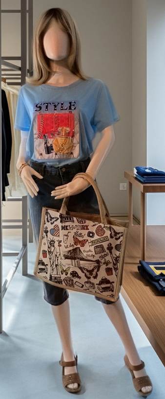
My styling approach for “Summertime Blues” focuses on keeping things effortlessly cool, comfortable, and a bit tongue-in-cheek. The foundation of this look relies on a basic pair of denim Bermuda shorts. To elevate the casual base, I paired it with a statement graphic t-shirt. The shirt features an ornate printed graphic complete with faux pearls, rhinestones, and the word “STYLE” boldly emblazoned across the front. It is an intentionally humorous, self-referential statement—letting the shirt playfully declare the outfit’s intent so your clothes do the talking for you.

To finish the look, a structured, New York-themed doodle tote bag adds a relaxed, graphic charm that complements the blue tones. For accessories, I stacked four simple, comfortable elastic beaded bracelets. They are incredibly fun to wear and perfectly pick up the contrasting colors from the tote bag to create harmony. Down below, a pair of tan, neutral-toned sandals ground the look, featuring just a hint of subtle pink sparkle to tie the outfit together.

Best of all, creating a high-fashion look doesn’t require a high-fashion budget. I sourced every single piece from ABC Superstore in Linden, New Jersey, with prices ranging between $6 and $12.99 per item. It goes to show that styling can be incredibly affordable. At the end of the day, you are your own stylist—you have the ultimate power to mix, match, and unlock your unique vision.


Transparency Note: This blog posting is a collaboration between me and Gemini, available through Google. Gemini served as an AI editor to organize and refine my original thoughts and dictation for clarity.

Photo: Emily Ann May
Camera: LG Android Phone Camera
Photo editing: Google Editor for Android Phone – Replaced background

AI License: I release my photo into the Commons for reuse, including training AI.

Styling: Mix-it up!

Introduction

Have you ever wondered how you would style an ensemble built around pieces with a designer name? At the same time did you move away from thinking about it because you consider designer name clothing out of reach? Well, I am here to tell you it can be within reach! I will share with you how I am doing this right now!

This is a big breakthrough for me on a personal level. It marks how much progress I am making through a study of styling outfits for myself using modern clothing.

Backstory

Last year I took a break from posting about drafting my patterns and sewing outfits based on vintage inspirations. I decided to teach myself styling. I bought a cheap mannequin. I shopped my closet and applied styling principles to create outfits. Once I learned all my lessons I donated the clothing to a community center for distribution to members of our immigrant community. I no longer needed that clothing because it was part of my time in the corporate world. I have moved into a career in manufacturing where my former wardrobe is not suitable as work wear.

New development and focus

I am building a casual wardrobe based on style icons I consider excellent examples of smart, stylish clothing for mature women. One of my icons is Gloria Vanderbilt. She was a socialite and heiress and also a fashion designer. Her line is still in production and available at affordable prices. I will cover Gloria in another posting. In this one I want to show you how I styled and accessorized a casual designer outfit by mixing up the accessories. The surprise element here is that the accessories were bargain priced!

Outfit: Smart and stylish weekend wear

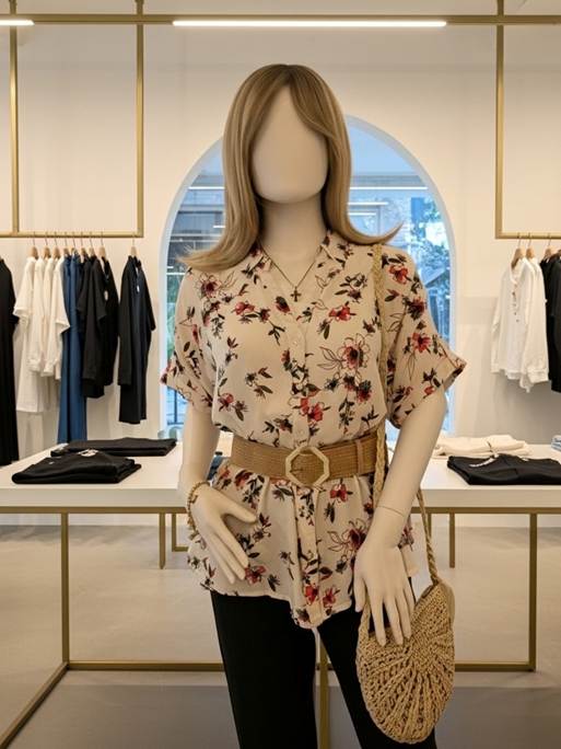
The Amada Jeans and blouse shown on Katie, my mannequin, are from Gloria Vanderbilt. The Amanda Jeans are a stretch denim that rests at the natural waistline. The fit is good and the jeans are comfortable. I find movement quite easy when I wear my Amandas. The jeans tend to be on the long side. I just roll them up at the hem. This impromptu cuff stays in place.

The floral print blouse features a watercolor-like print of soft red flowers on a white background. The blouse is very roomy. I measured it as 44” total circumference at bust level. For a size Medium this makes for a very loose fit. I decided to make the waistline the focal point of my ensemble. To keep all parts in balance I choose beige/cream/light tan neutral accessories. Although the accessories do not exactly match each other, they fool the eye when worn together. This is because the accessories are subdued and do not dominate the field of vision. This preserves the print on the blouse as the primary visual and the belt as the focal point.

Adding Shape

While the blouse is pretty as is, it becomes more flattering with the peplum like effect the belt creates. The peplum effect is balanced by the smooth fit of the straight leg jeans.

Mixing it up

The Gloria Vanderbilt Amanda Jeans and blouse were purchased on Amazon. Together they cost around $50. I did not want to spend too much on accessories, so I went bargain hunting at Amazon and in my neighborhood.

The belt and bag were close to what I was looking for. The sandals came from a local store that sells close-outs of name brands. All together the cost was about $40. Since the accessories are neutrals, they will work well with other outfits.

The Golden Touch

I added a touch of vintage to this outfit through my choice of jewelry. I chose a late 1980s Avon charm bracelet my Mom left to me. It adds an understated chic to the complete outfit.

Conclusion

Styling this outfit and evaluating the photographs is part of my self-learning. When you study the visual impact of an outfit you can see it as others do. This is an important skill to cultivate. It will help a person gain confidence in their own style sense. It is not necessary to achieve perfection where everything looks so put together it is flawless. That is not interesting! I would rather see someone wearing their own carefully styled outfit than a copy of something from a store window or website.

The fun comes from the adventure of assembling different pieces and mixing them up. I hope this outfit has inspired you to pair designer pieces with vintage or bargain store finds. Not only is the search fun, but the wearing is also more enjoyable!

Disclosure: This posting was conceived, drafted, and written by me. AI was not used as an editing tool. Please note I am not affiliated with Amazon or Gloria Vanderbilt clothing lines. I do not receive remuneration for featuring any items shown in my photos or written about in this blog post.

All photos were taken by me (Emily Ann May) with my LG camera phone. Gemini was used to replace the background in each photo. Gemini is available through Google Search.

AI License: I permit use of my photos to train AI.

Commons License: I release my photos into the commons for reuse. A link back to this blog is appreciated.

Skip the Boning: How “Gertie Sews Jiffy Dresses” Achieves the Perfect 1950s Silhouette

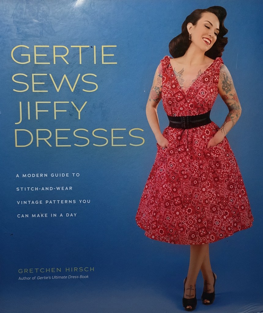
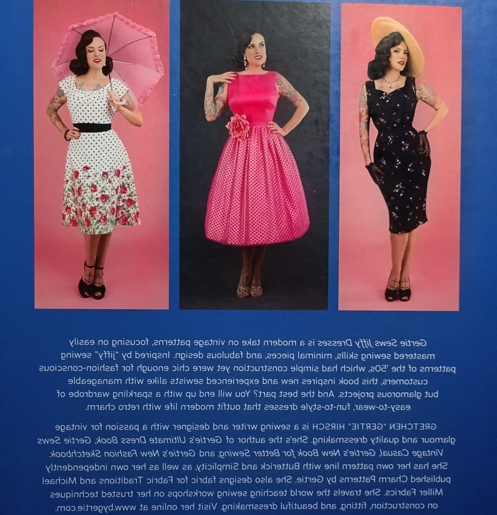
The front and back covers of “Gertie Sews Jiffy Dresses,” showing the beautiful, wearable 1950s silhouettes featured inside the book.


Introduction

In this post, I review “Gertie Sews Jiffy Dresses” by Gretchen Hirsch. Of all her books, this is my all-time favorite. Let’s look at why I rate this book so highly. I’m sure fellow vintage style lovers will agree with me.

Gertie Sews Jiffy Dresses: A review

These are vintage styles you can wear today. They are smart, attractive, feminine, and classic, with no camp or costume involved. There is enough ease to feel comfortable without sacrificing ease of movement. Gertie achieves a 1950s hourglass look through waist cinch belts, sashes, or shirring rather than restrictive boning. She does discuss vintage foundation garments, though I see this as more educational than essential for these specific styles.

The Popover Dress, shown on the cover, perfectly exemplifies the accessibility and wearability of Gertie’s designs. It is basically a tent shape, but the cute shoulder bows draw the eye upward, and the roomy cut is flattering and comfortable. Gertie gives it shape with a wide, black elastic waist cincher.

Gertie also stays true to one of her core guiding principles by offering variations on the basic styles. For example, the Popover Dress pattern can be cut on the bias for a more supple, body-skimming fit. By using elastic shirring at the waist, Gertie achieves the dual goals of a shapely, vintage look. The result is a classic silhouette any woman will feel comfortable and beautiful wearing.

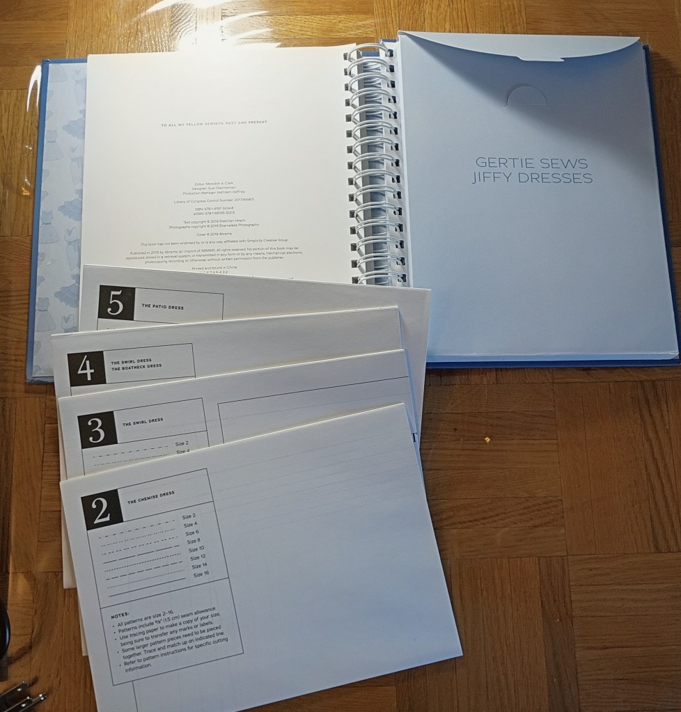
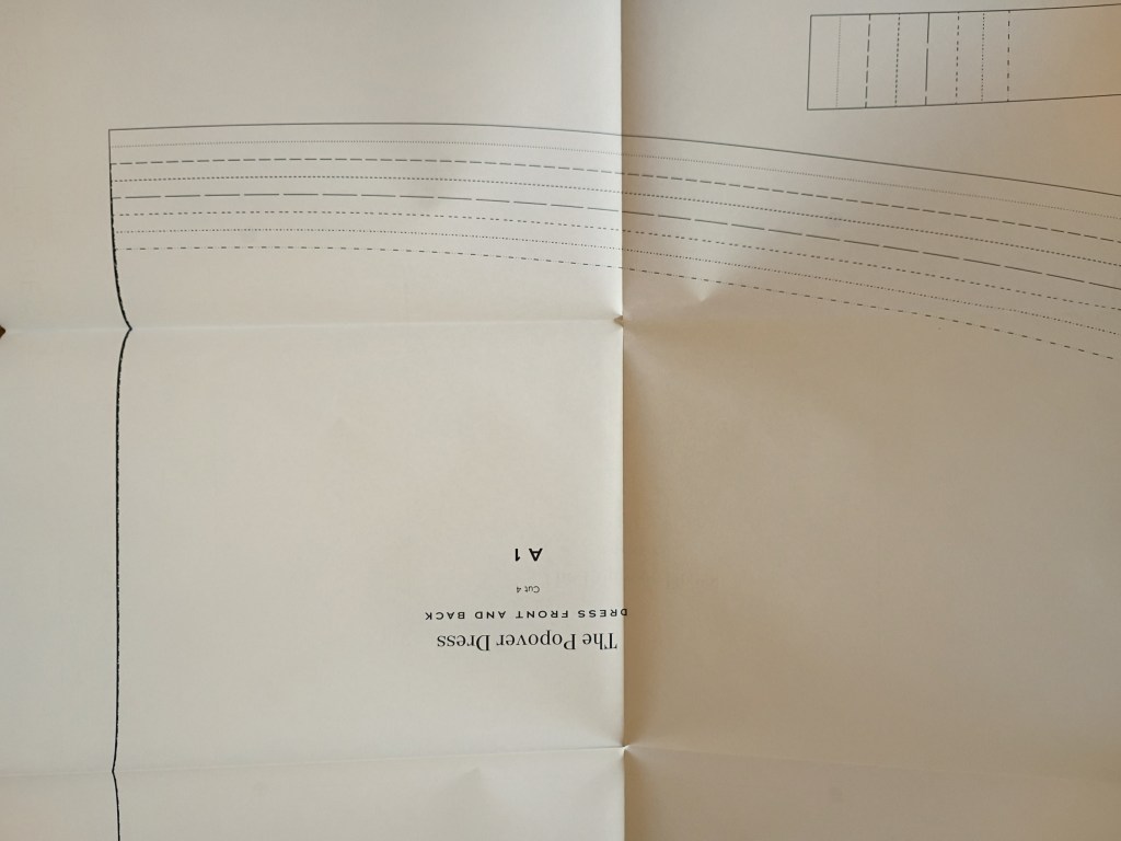
Other features make this a valuable addition to any dressmaker’s library. Gertie covers the basic and advanced sewing techniques needed for each dress, detailing notions, fitting, and suitable fabrics. A big plus is that each pattern comes on its own sheet with clearly defined lines for easy tracing.

In the next section, I include photos of key parts of the book, like the index, size chart, and pages that showcase the layout and presentation.

I highly recommend this book because it offers vintage style grounded in real wearability. Plus, the classic foundation of each dress allows you to easily add your own personal style with accessories.


Photos from “Gertie Sews Jiffy Dresses”

A spiral-bound sewing book titled Gertie Sews Jiffy Dresses sitting open on a wooden table, with several separate white pattern sheets labeled with numbers 2 through 5 stacked neatly in the foreground.

Each pattern comes on its own high-quality sheet with clear, easy-to-read lines.

A close-up view of a large white paper sewing pattern sheet from the book, showing different styles of dashed and dotted size lines for the Popover Dress pattern pieces.

The pattern lines for each size are clearly defined and very easy to differentiate.

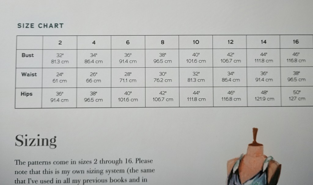
A close-up view of the sizing page from the book, featuring a clean grid chart showing bust, waist, and hip measurements in inches and centimeters for sizes 2 to 16.

The easy-to-understand size chart gives the basic body measurements for sizes 2 through 16.

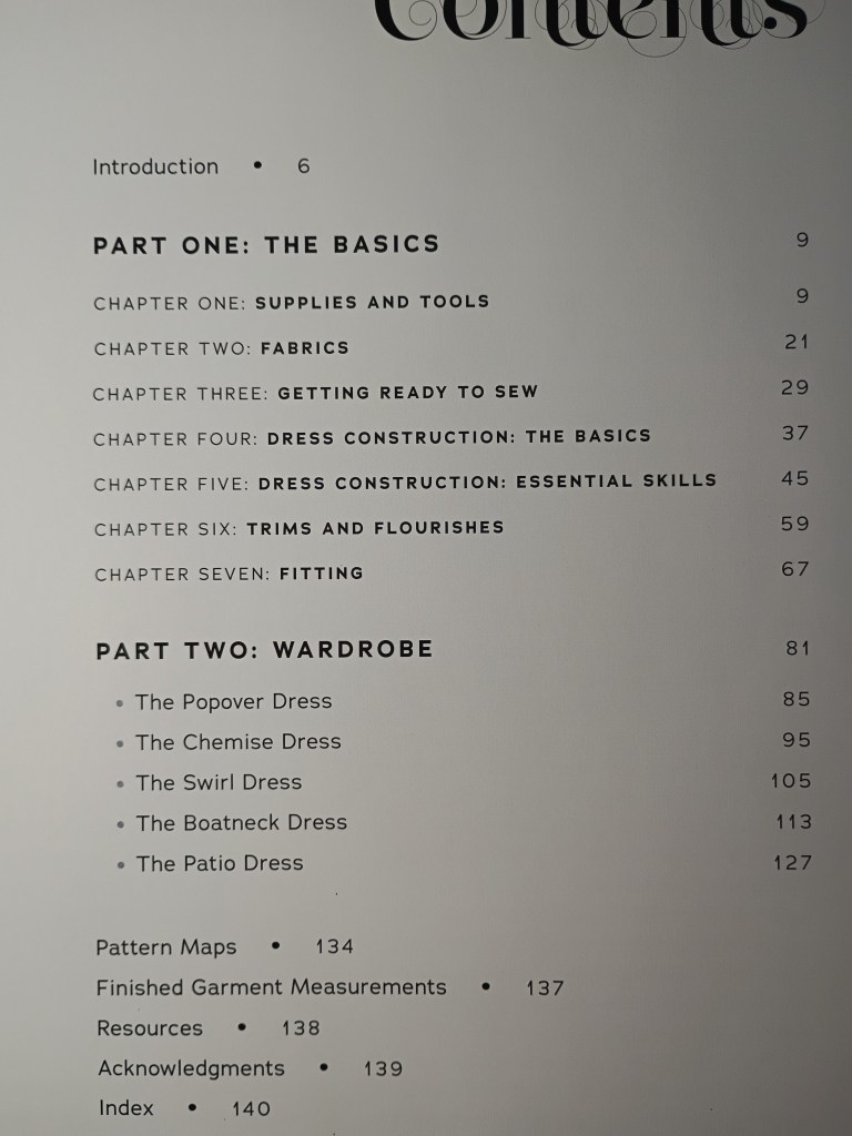
A close-up photograph of the Table of Contents page from the sewing book, detailing the page numbers for Part One: The Basics and Part Two: Wardrobe, including specific dresses like The Popover Dress and The Chemise Dress.

The table of contents accurately lists each chapter, dress pattern, and page number for quick reference.

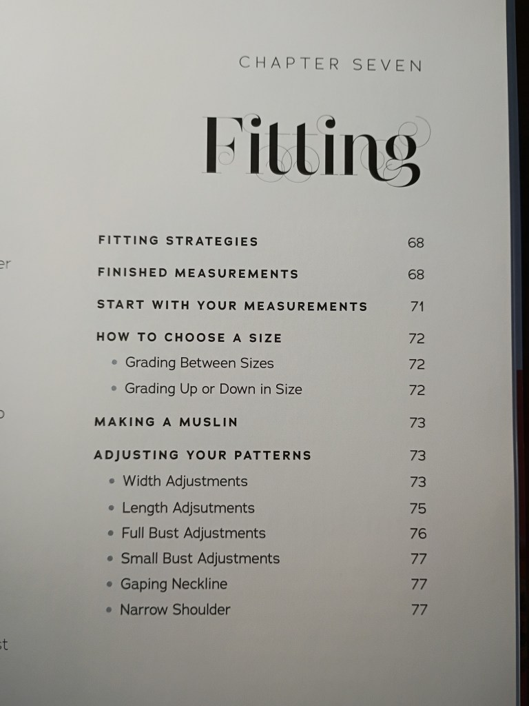
A close-up photograph of the Chapter Seven title page, titled Fitting, showing a detailed index of subheadings like Choosing a Size and Adjusting Your Patterns alongside their exact page numbers.

Each chapter features its own detailed index with subheadings and page numbers, making it easy to jump straight to a specific topic like the fitting strategies shown here for Chapter 7.


Transparency disclosure: This blog post was created, drafted, and structured by me. The photos were taken with my LG Cricket Wireless Android phone and edited with AI enhancements. The review itself was edited by Gemini for clarity and conciseness. Gemini is an AI assistant available through Google.


Beauty on a Budget: How to Make Discount Separates Look Like a Designer Set

The Invisible Stylist: High-End Coordination on a Budget

We’ve all been told that “style isn’t about how much you spend,” but the secret to proving it lies in understanding cohesion. When you look at an outfit, your eye shouldn’t just see individual pieces; it should experience a harmonious “big picture.”

The Anchor Piece

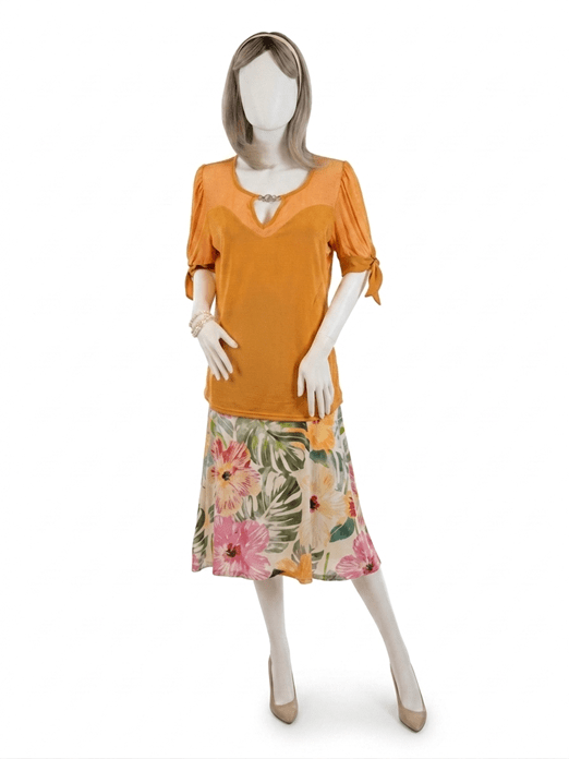
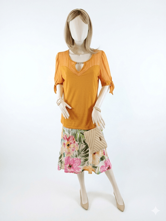
This look started with a tropical-print skirt featuring a lush palette of Sage and Emerald Green foliage on a soft Cream base. As someone trained in the technical side of fashion—patternmaking and draping—I know that a busy print is actually a roadmap for the rest of your outfit.

The “Invisible Stylist” Hack

To find the top, I looked for a shade that would pull from the Hibiscus Pink and Papaya accents in the floral print. I landed on this vibrant Apricot knit.

Here is my favorite budget secret: You don’t have to shop at luxury boutiques to get a “designed” look. Professional buyers for bargain stores visit the same global showrooms to curate their seasonal collections. They have a trained eye for color harmony. When you find a store where the separates consistently “talk” to each other, you’ve essentially found an invisible personal stylist. They’ve done the hard work of ensuring the colors under their roof harmonize; you just have to spot the connections.

Shopping Your Closet

The final layer of cohesion comes from your neutrals. By staying true to a consistent “favorite” palette, you unlock incredible flexibility.

  • The Accessories: I pulled these Champagne pumps and headband from my own wardrobe.
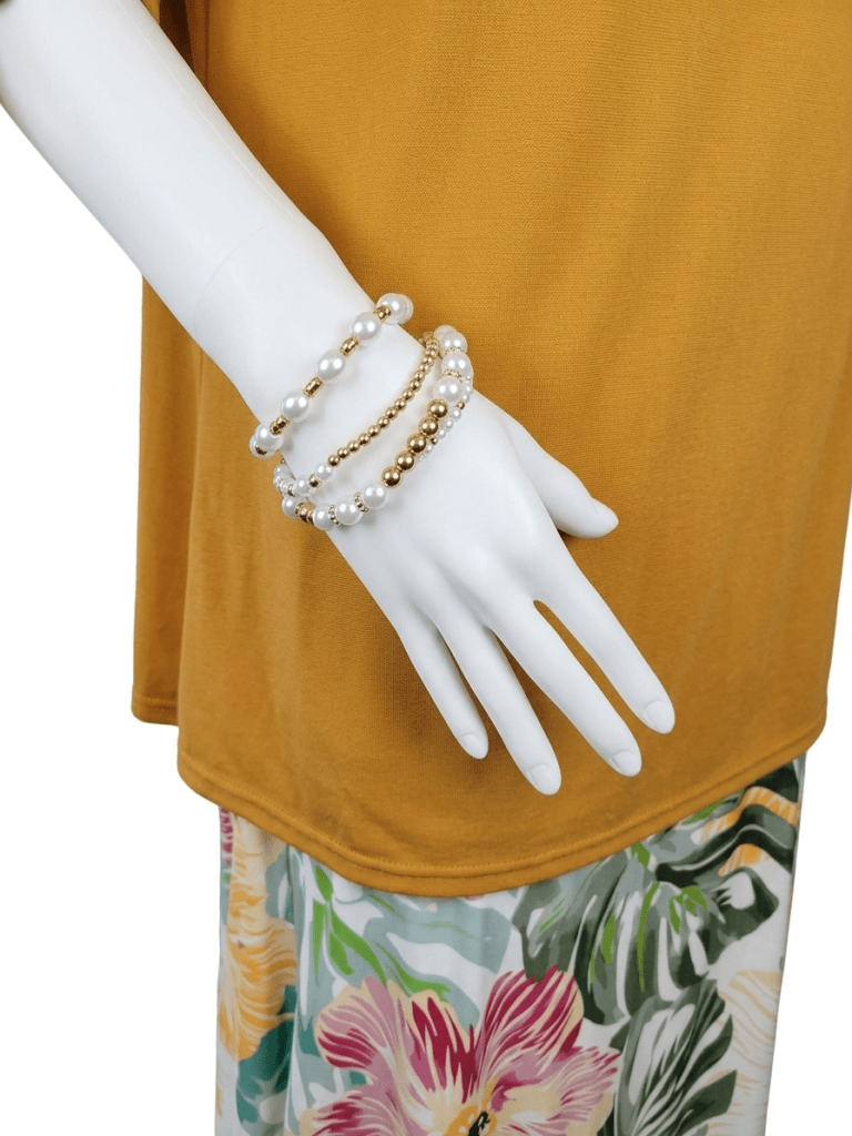
  • The Finishing Touches: A pair of Alabaster and Lustrous Gold bracelets, paired with an Antique White quilted wristlet, bridge the gap between the skirt’s background and the brighter highlights of the top.

The shades aren’t identical, but they share a warm, golden undertone that “fools” the eye into seeing a custom-made ensemble.

The Bottom Line

When the colors harmonize and the “little pictures” fit together, nobody—and I mean nobody—will guess these pieces came from a discount rack. Walk out the door, enjoy the compliments, and keep your budget your little secret.

About the Author

EmilyAnn  is a skilled patternmaker and dressmaker who trained at The French Fashion Academy in New York City, which was famously located in Midtown Manhattan. In addition to creating vintage-inspired patterns and garments, she is a passionate bargain shopper and stylist with an eye for unique finds.

Credits

This posting is a collaboration between the author, Gemini and Nano Banana.

  • Gemini: Language and color refinement assistance.
  • Photography: All photos were taken by the author with an LG Android Camera Phone and edited using Nano Banana.

#BeautyOnABudget #AffordableFashion #StyleOnAWhim #BudgetChic : #TropicalPrint #ApricotAndPink #ColorHarmony #ShopYourCloset #MixAndMatch #WardrobeEssentials #InvisibleStylist #TropicalPrint #SummerOOTD #ApricotAndPink #ColorHarmony

Transitioning to Early Spring: A Practical Boho-Chic Approach

🌸 Introduction

As we move away from the heavy layers of winter, the transition to spring can be a bit of a fashion puzzle—especially on those overcast, rainy days. My latest look focuses on a minimalist, transitional aesthetic that doesn’t sacrifice practicality for style.

The Foundation: Grounded in Black

While we all crave lighter colors this time of year, black remains a working woman’s best friend. Whether you’re navigating public transit or avoiding splashes from a spring downpour, black is infinitely easier to maintain. This outfit is designed to pair perfectly with your reliable black raincoat or winter jackets, allowing you to stay warm and spot-free during the “chilly-rainy” weeks.

The Sparkle: A Subtle Boost

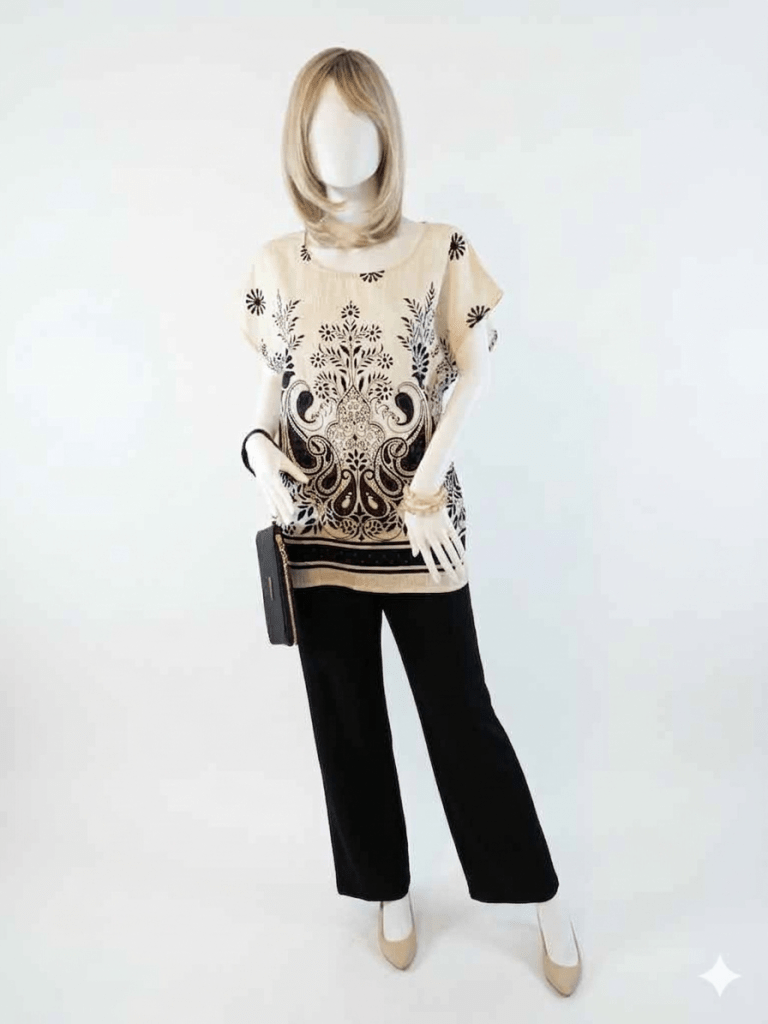
The centerpiece is this stunning paisley-print tunic. Upon closer look, it features tiny white crystals that catch the light—a subtle “mood booster” for those gray, overcast mornings. It provides that much-needed feeling of spring brightness while the weather is still catching up.

The Transition: Accessories that Lighten the Look

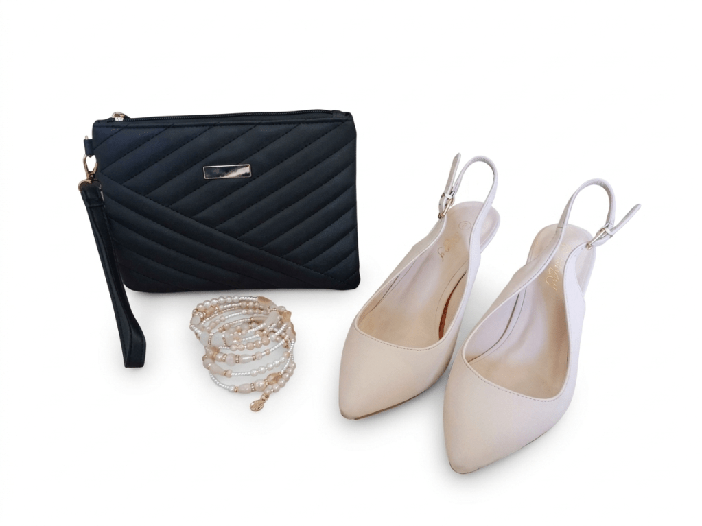
To bridge the gap between seasons, I’ve swapped heavy boots for cream-colored slingbacks. This immediately lightens the silhouette. We’ve finished the look with:

  • A gold-tone crystal beaded bangle for a touch of warmth.
  • A sleek black wristlet to keep the look streamlined and professional.

Get the Look: The Minimalist Spring Transition

This ensemble is all about balancing the freshness of a new season with the practical realities of a busy life.

  • The Statement Top: A cream, paisley-print tunic with subtle crystal embellishments. The neutral base says “spring,” while the dark print pairs effortlessly with winter basics.
  • The Foundation: Straight-leg black trousers. Polished, professional, and resistant to the “real world” elements like rain and transit.
  • The Seasonal “Lift”: Cream-colored pointed-toe slingback kitten heels. These provide a much-needed visual lightness that signals the end of winter.
  • The Finishing Touches:
    • A black quilted wristlet for a hands-free, streamlined silhouette.
    • A stack of neutral and gold-tone beaded bangles for a touch of bohemian texture.

Stylist Tip: When the weather is overcast, let your clothes do the work. The tiny crystals on this tunic add just enough sparkle to brighten a gray day without feeling over-the-top.


✨ Garment Care Tiip: Protecting the Sparkle and Beading on a Top or Sweater

When a sweater or  top features delicate, glued-on crystal accents or beading on a soft poly-blend fabric, a little extra “TLC” during laundry day goes a long way. To keep the sparkle bright and the fabric smooth, I recommend this gentle hand-washing routine:

  • Prep for Safety: Turn the blouse inside out to protect the crystals from friction.
  • The “Double Guard” Method: Gently fold the top and place it inside a mesh laundry bag before washing.
  • The Gentle Soak: Submerge the bag in a basin of cold water mixed with a delicate wash (like Woolite). Let it soak—no aggressive scrubbing is needed!
  • Rinse & Squeeze: Rinse thoroughly with cold water. To remove excess moisture, squeeze gently rather than wringing or twisting the fabric.
  • The Finish: Remove the top from the mesh bag and dry flat on a drying rack. This prevents the poly-blend from stretching and ensures the crystals or beads stay perfectly in place.

Disclosure

This posting is the product of my original styling idea. I developed the draft through a detailed session with Gemini. In that session the idea was given form and the posting created. Gemini is accessed through Google Search.

The photos were taken by me using my Android LG phone.

Photo editing was performed in a two step proocess. The prompts were created through discussion with Gemini. The approved prompts where then sent to Nano Banana. The backgrounds were replaced with the white background you see in the photos used for the posting. Nano Banana is available within Gemini through Google Search.


I release my photos into the public domain. They may be used to train AI or for non-commercial purposes. A link back to this blog is appreciated.

Building an Outfit Around a Focal Point: Let One Special Piece Lead the Way

Introduction

A well‑chosen focal point gives an outfit unity and intention. The eye naturally travels to the element you want to highlight, so it’s worth considering what you emphasize and why. When you choose pieces that enhance your best features and support your focal point, your outfit feels harmonious from the start. This is especially helpful when shopping for new wardrobe additions. In this post, I’ll show you how I selected three pieces — each from a different manufacturer — and coordinated them into a unified look by focusing on color and a clear focal point.


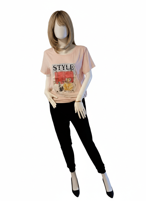
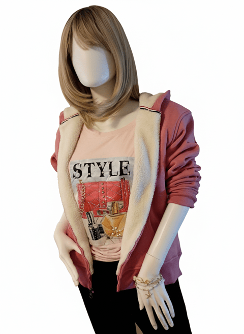
Beginning: A Rhinestone‑and‑Pearl T‑Shirt With the Word STYLE

A cheerful spring‑ready look built around one uplifting focal poiny.

This pink t‑shirt immediately felt like Spring to me — soft, cheerful, and perfect for that in‑between season when we’re longing for sunshine, warmth, and the first fragrance of flowers. The cut is loose and not particularly flattering on its own, but the decorative panel on the front makes it special. The word STYLE is embellished with pearls, and the illustrated cosmetics below it sparkle with rhinestones. The panel’s deeper pink background adds dimension and contrast. I knew right away this was the uplifting piece I needed to bridge the time between February and April.

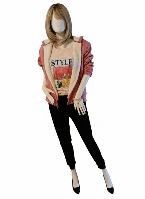
Layering soft pinks creates warmth and harmony, especially when textures play together.

My next step was choosing colors to complement the t‑shirt. I took my cue from the illustration: a dark navy lipstick tube stood out to me. With that in mind, I browsed the racks and found a pair of dark navy plus‑velvet sports slacks. They’re slim‑fitting with ankle cuffs, and the rich texture contrasts beautifully with the smooth t‑shirt. I planned to wear black pumps with this outfit — the black echoes the lettering on the shirt and keeps the attention where it belongs, without competing with the focal point.

The finished outfit: coordinated colors, mixed textures, and a focal point that shines.

The final clothing piece was a sweater or hoodie. I chose a fleece‑lined hoodie in a deeper pink. Its shade is close enough to the darker pink in the t‑shirt’s panel to feel related, especially when paired with the white fleece lining. Whether worn open or slightly zipped, the lining softens the transition between the two pinks and helps the eye read them as a coordinated pair.

To finish the look, I gathered the t‑shirt at the side and tied a small knot. This adds shape, keeps the hem neat, and supports the overall silhouette. For accessories, I kept things simple. When wearing just the slacks and t‑shirt, a gold bangle complements the golden perfume bottle on the decorative panel. When the hoodie is added, stretch bracelets with white and gold beads tie in beautifully with the panel’s details and the hoodie’s lining.


Conclusion

By keeping the focal point in mind, I had a clear guide while shopping. The result is a coordinated outfit with room to grow as I add more tops or bottoms in similar tones and textures. The lesson here is that you don’t always need a plan before you shop. Start with the one striking piece that catches your eye. Then let color, texture, and your chosen focal point lead the way. From there, the outfit will naturally take shape.

Thank you for spending this styling moment with me — may your next “just‑because” purchase spark a little joy and guide you toward an outfit that feels beautifully, confidently you.

Style Tip: Let Your Focal Point Do the Talking

  • Start with one striking piece that lifts your mood.
  • Pull supporting colors from the details — even tiny ones count.
  • Mix textures to add richness without overwhelming the eye.
  • Keep accessories simple so your focal point stays center stage.
  • When in doubt, trust your instincts; harmony often begins with the piece you love most.

Disclosures

This post was drafted by me.
I collaborated with Microsoft Copilot to refine the text and tighten narrative flow.
I took the photos using the camera in my Cricket LG Phone.
Gemini and Nano Banana, accessed through Google Search, edited the photos by removing the backgrounds.

Transitioning to Spring through sleep and lounge wear

Shades of teal, pink and grey create a light, fun mood that prepares mind and soul for the coming Spring.

Introduction

It is February and the temperatures are still below freezing for many days. Snow has fallen in your area. Once pristine and fluffy, it is now hard and dirty. Heavy snow boots and layers of clothing keep you warm. Overall, you feel tired and winter weary after your commute to work or errands around the neighborhood. How do you revive your spirits?

The answer is simple: self care and a coordinated set of new sleepwear or loungewear. All it takes are a few pieces to perk up your spirits. Suddenly being home does not mean putting on old, faded pajamas for bed. Nor does it mean wearing a faded track suit and old slippers.

Choose a lightly scented floral fragrance

Turn the evening into a spa evening at home. After bath or shower use a body lotion and moisturizer of choice. Fragrance is a big mood booster, too. Pick up a bottle of a fun fragrance at your local pharmacy/retail chain store. Something light and floral will put you into a mood that aligns with the coming of Spring. Remember, under that hard frost Mother Earth is nourishing the roots of trees, bulbs, and plants. In 6 to 8 weeks buds will be green and small shoots of grass and flowers will peek out into the sunshine. So keep the fragrance choice light hearted and something you enjoy. It is not necessary to buy a long-lasting, expensive perfume that might be out of your budget. This is about fragrance as a key to set a mood in the moment. From that moment you mentally and emotionally move into Spring.

Begin attuning your color choices to Spring

Choose a robe in a color that coordinates with your sleepwear.

Color plays a particularly important part in this shift from winter weary to light hearted and hopeful of the changing season. I bought a nightgown in a print showing pink, teal, and grey cats, Some look happy, others look a little grumpy. The first ones I notice are the cute, happy cats. In a way this reminds me that we should always choose the positive mood that communicates an upbeat state of mind.

Add a touch of bling in your choice of slippers or slides.

To coordinate with the nightgown, I decided to put the deep, jewel colors of winter away. A plush, velour robe in a rich teal color provides a pop of coordinating color to the nightgown. To complete the look, I chose a pair of open toe slides in black satin. A touch of bling turns the slides into a very adaptable fashion accessory. A jeweled clip that came with the slides provides a final addition to this sleepwear ensemble. The chunky rhinestones on the clip are close to the shades of pink and teal in the nightgown and robe. The look is completed by a comfortable, stretch hairband in pink.

Conclusion

This wonderfully comfortable and budget friendly nightwear ensemble makes the time before bed an affirmation that Spring is already beginning. The conscious choice of colors and fragrance affirm a mind and spirit already aligning with the return of sunshine and color to the world.

#loungewear #sleepwear #budgetfashion #selfcare #fashiononabudget

Note: This post was written by me based on my actual shopping and styling experience. No AI was used to draft or revise it. The photos were taken with my Android LG phone camera. Editing and removing the background was done using Nano Banana, accessed through Gemini on Google Search.