Introduction
A well‑chosen focal point gives an outfit unity and intention. The eye naturally travels to the element you want to highlight, so it’s worth considering what you emphasize and why. When you choose pieces that enhance your best features and support your focal point, your outfit feels harmonious from the start. This is especially helpful when shopping for new wardrobe additions. In this post, I’ll show you how I selected three pieces — each from a different manufacturer — and coordinated them into a unified look by focusing on color and a clear focal point.
Beginning: A Rhinestone‑and‑Pearl T‑Shirt With the Word STYLE
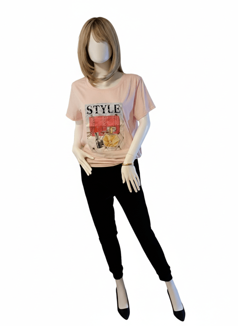
A cheerful spring‑ready look built around one uplifting focal poiny.
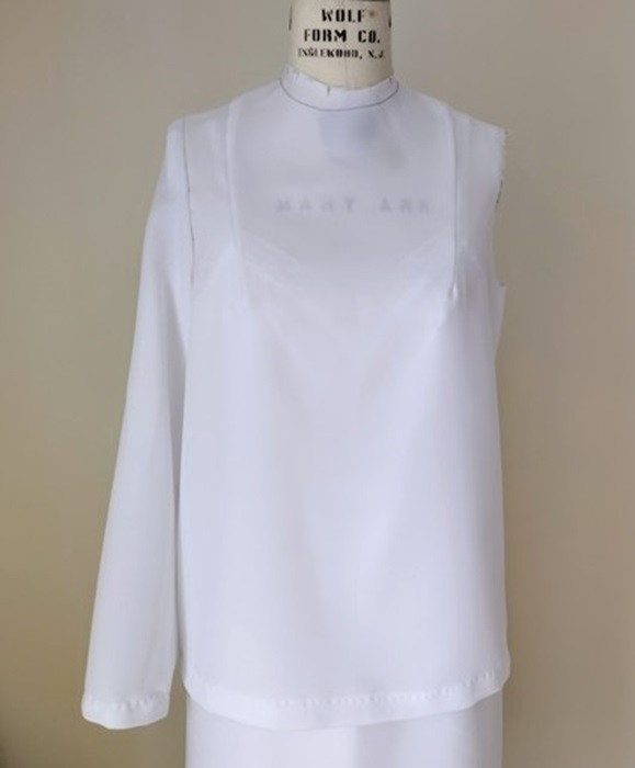
This pink t‑shirt immediately felt like Spring to me — soft, cheerful, and perfect for that in‑between season when we’re longing for sunshine, warmth, and the first fragrance of flowers. The cut is loose and not particularly flattering on its own, but the decorative panel on the front makes it special. The word STYLE is embellished with pearls, and the illustrated cosmetics below it sparkle with rhinestones. The panel’s deeper pink background adds dimension and contrast. I knew right away this was the uplifting piece I needed to bridge the time between February and April.
Layering soft pinks creates warmth and harmony, especially when textures play together.
My next step was choosing colors to complement the t‑shirt. I took my cue from the illustration: a dark navy lipstick tube stood out to me. With that in mind, I browsed the racks and found a pair of dark navy plus‑velvet sports slacks. They’re slim‑fitting with ankle cuffs, and the rich texture contrasts beautifully with the smooth t‑shirt. I planned to wear black pumps with this outfit — the black echoes the lettering on the shirt and keeps the attention where it belongs, without competing with the focal point.
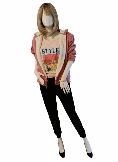
The finished outfit: coordinated colors, mixed textures, and a focal point that shines.
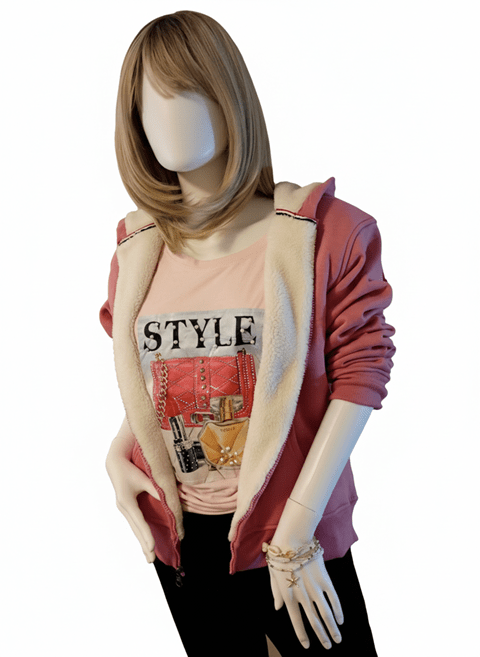
The final clothing piece was a sweater or hoodie. I chose a fleece‑lined hoodie in a deeper pink. Its shade is close enough to the darker pink in the t‑shirt’s panel to feel related, especially when paired with the white fleece lining. Whether worn open or slightly zipped, the lining softens the transition between the two pinks and helps the eye read them as a coordinated pair.
To finish the look, I gathered the t‑shirt at the side and tied a small knot. This adds shape, keeps the hem neat, and supports the overall silhouette. For accessories, I kept things simple. When wearing just the slacks and t‑shirt, a gold bangle complements the golden perfume bottle on the decorative panel. When the hoodie is added, stretch bracelets with white and gold beads tie in beautifully with the panel’s details and the hoodie’s lining.
Conclusion
By keeping the focal point in mind, I had a clear guide while shopping. The result is a coordinated outfit with room to grow as I add more tops or bottoms in similar tones and textures. The lesson here is that you don’t always need a plan before you shop. Start with the one striking piece that catches your eye. Then let color, texture, and your chosen focal point lead the way. From there, the outfit will naturally take shape.
Thank you for spending this styling moment with me — may your next “just‑because” purchase spark a little joy and guide you toward an outfit that feels beautifully, confidently you.
Style Tip: Let Your Focal Point Do the Talking
- Start with one striking piece that lifts your mood.
- Pull supporting colors from the details — even tiny ones count.
- Mix textures to add richness without overwhelming the eye.
- Keep accessories simple so your focal point stays center stage.
- When in doubt, trust your instincts; harmony often begins with the piece you love most.
Disclosures
This post was drafted by me.
I collaborated with Microsoft Copilot to refine the text and tighten narrative flow.
I took the photos using the camera in my Cricket LG Phone.
Gemini and Nano Banana, accessed through Google Search, edited the photos by removing the backgrounds.


You must be logged in to post a comment.