Styling: Mix-it up!

Introduction

Have you ever wondered how you would style an ensemble built around pieces with a designer name? At the same time did you move away from thinking about it because you consider designer name clothing out of reach? Well, I am here to tell you it can be within reach! I will share with you how I am doing this right now!

This is a big breakthrough for me on a personal level. It marks how much progress I am making through a study of styling outfits for myself using modern clothing.

Backstory

Last year I took a break from posting about drafting my patterns and sewing outfits based on vintage inspirations. I decided to teach myself styling. I bought a cheap mannequin. I shopped my closet and applied styling principles to create outfits. Once I learned all my lessons I donated the clothing to a community center for distribution to members of our immigrant community. I no longer needed that clothing because it was part of my time in the corporate world. I have moved into a career in manufacturing where my former wardrobe is not suitable as work wear.

New development and focus

I am building a casual wardrobe based on style icons I consider excellent examples of smart, stylish clothing for mature women. One of my icons is Gloria Vanderbilt. She was a socialite and heiress and also a fashion designer. Her line is still in production and available at affordable prices. I will cover Gloria in another posting. In this one I want to show you how I styled and accessorized a casual designer outfit by mixing up the accessories. The surprise element here is that the accessories were bargain priced!

Outfit: Smart and stylish weekend wear

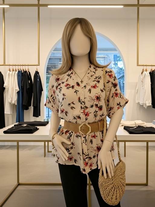
The Amada Jeans and blouse shown on Katie, my mannequin, are from Gloria Vanderbilt. The Amanda Jeans are a stretch denim that rests at the natural waistline. The fit is good and the jeans are comfortable. I find movement quite easy when I wear my Amandas. The jeans tend to be on the long side. I just roll them up at the hem. This impromptu cuff stays in place.

The floral print blouse features a watercolor-like print of soft red flowers on a white background. The blouse is very roomy. I measured it as 44” total circumference at bust level. For a size Medium this makes for a very loose fit. I decided to make the waistline the focal point of my ensemble. To keep all parts in balance I choose beige/cream/light tan neutral accessories. Although the accessories do not exactly match each other, they fool the eye when worn together. This is because the accessories are subdued and do not dominate the field of vision. This preserves the print on the blouse as the primary visual and the belt as the focal point.

Adding Shape

While the blouse is pretty as is, it becomes more flattering with the peplum like effect the belt creates. The peplum effect is balanced by the smooth fit of the straight leg jeans.

Mixing it up

The Gloria Vanderbilt Amanda Jeans and blouse were purchased on Amazon. Together they cost around $50. I did not want to spend too much on accessories, so I went bargain hunting at Amazon and in my neighborhood.

The belt and bag were close to what I was looking for. The sandals came from a local store that sells close-outs of name brands. All together the cost was about $40. Since the accessories are neutrals, they will work well with other outfits.

The Golden Touch

I added a touch of vintage to this outfit through my choice of jewelry. I chose a late 1980s Avon charm bracelet my Mom left to me. It adds an understated chic to the complete outfit.

Conclusion

Styling this outfit and evaluating the photographs is part of my self-learning. When you study the visual impact of an outfit you can see it as others do. This is an important skill to cultivate. It will help a person gain confidence in their own style sense. It is not necessary to achieve perfection where everything looks so put together it is flawless. That is not interesting! I would rather see someone wearing their own carefully styled outfit than a copy of something from a store window or website.

The fun comes from the adventure of assembling different pieces and mixing them up. I hope this outfit has inspired you to pair designer pieces with vintage or bargain store finds. Not only is the search fun, but the wearing is also more enjoyable!

Disclosure: This posting was conceived, drafted, and written by me. AI was not used as an editing tool. Please note I am not affiliated with Amazon or Gloria Vanderbilt clothing lines. I do not receive remuneration for featuring any items shown in my photos or written about in this blog post.

All photos were taken by me (Emily Ann May) with my LG camera phone. Gemini was used to replace the background in each photo. Gemini is available through Google Search.

AI License: I permit use of my photos to train AI.

Commons License: I release my photos into the commons for reuse. A link back to this blog is appreciated.

Beauty on a Budget: How to Make Discount Separates Look Like a Designer Set

The Invisible Stylist: High-End Coordination on a Budget

We’ve all been told that “style isn’t about how much you spend,” but the secret to proving it lies in understanding cohesion. When you look at an outfit, your eye shouldn’t just see individual pieces; it should experience a harmonious “big picture.”

The Anchor Piece

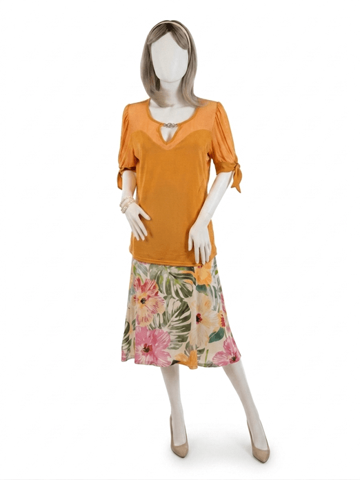
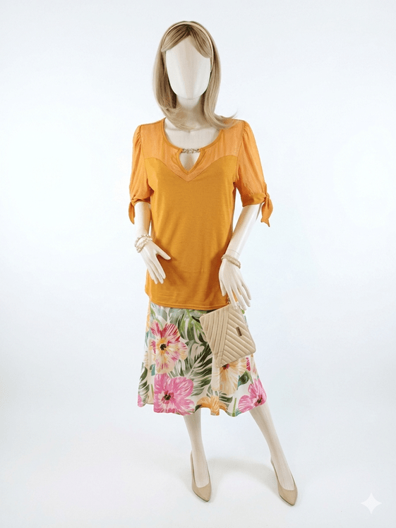
This look started with a tropical-print skirt featuring a lush palette of Sage and Emerald Green foliage on a soft Cream base. As someone trained in the technical side of fashion—patternmaking and draping—I know that a busy print is actually a roadmap for the rest of your outfit.

The “Invisible Stylist” Hack

To find the top, I looked for a shade that would pull from the Hibiscus Pink and Papaya accents in the floral print. I landed on this vibrant Apricot knit.

Here is my favorite budget secret: You don’t have to shop at luxury boutiques to get a “designed” look. Professional buyers for bargain stores visit the same global showrooms to curate their seasonal collections. They have a trained eye for color harmony. When you find a store where the separates consistently “talk” to each other, you’ve essentially found an invisible personal stylist. They’ve done the hard work of ensuring the colors under their roof harmonize; you just have to spot the connections.

Shopping Your Closet

The final layer of cohesion comes from your neutrals. By staying true to a consistent “favorite” palette, you unlock incredible flexibility.

  • The Accessories: I pulled these Champagne pumps and headband from my own wardrobe.
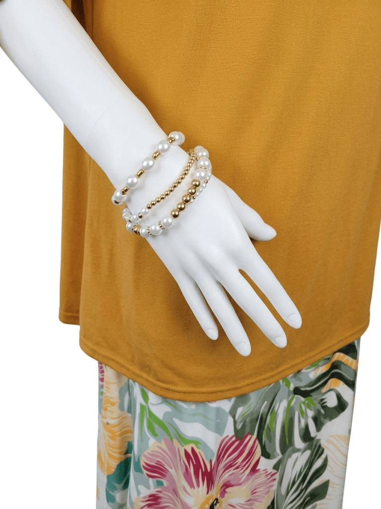
  • The Finishing Touches: A pair of Alabaster and Lustrous Gold bracelets, paired with an Antique White quilted wristlet, bridge the gap between the skirt’s background and the brighter highlights of the top.

The shades aren’t identical, but they share a warm, golden undertone that “fools” the eye into seeing a custom-made ensemble.

The Bottom Line

When the colors harmonize and the “little pictures” fit together, nobody—and I mean nobody—will guess these pieces came from a discount rack. Walk out the door, enjoy the compliments, and keep your budget your little secret.

About the Author

EmilyAnn  is a skilled patternmaker and dressmaker who trained at The French Fashion Academy in New York City, which was famously located in Midtown Manhattan. In addition to creating vintage-inspired patterns and garments, she is a passionate bargain shopper and stylist with an eye for unique finds.

Credits

This posting is a collaboration between the author, Gemini and Nano Banana.

  • Gemini: Language and color refinement assistance.
  • Photography: All photos were taken by the author with an LG Android Camera Phone and edited using Nano Banana.

#BeautyOnABudget #AffordableFashion #StyleOnAWhim #BudgetChic : #TropicalPrint #ApricotAndPink #ColorHarmony #ShopYourCloset #MixAndMatch #WardrobeEssentials #InvisibleStylist #TropicalPrint #SummerOOTD #ApricotAndPink #ColorHarmony

Building an Outfit Around a Focal Point: Let One Special Piece Lead the Way

Introduction

A well‑chosen focal point gives an outfit unity and intention. The eye naturally travels to the element you want to highlight, so it’s worth considering what you emphasize and why. When you choose pieces that enhance your best features and support your focal point, your outfit feels harmonious from the start. This is especially helpful when shopping for new wardrobe additions. In this post, I’ll show you how I selected three pieces — each from a different manufacturer — and coordinated them into a unified look by focusing on color and a clear focal point.


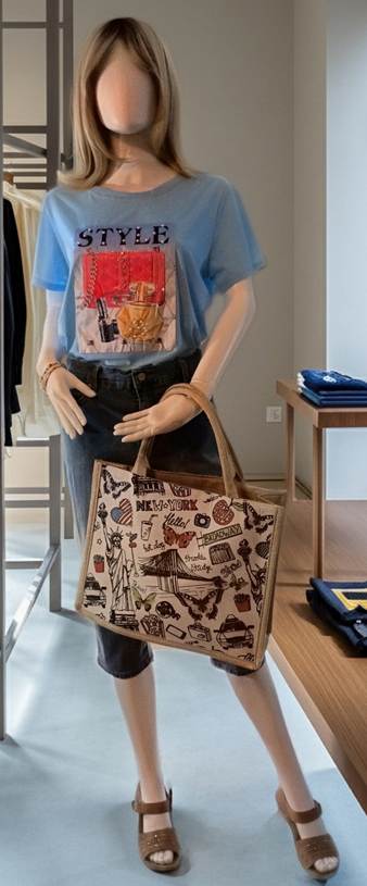
Beginning: A Rhinestone‑and‑Pearl T‑Shirt With the Word STYLE

A cheerful spring‑ready look built around one uplifting focal poiny.

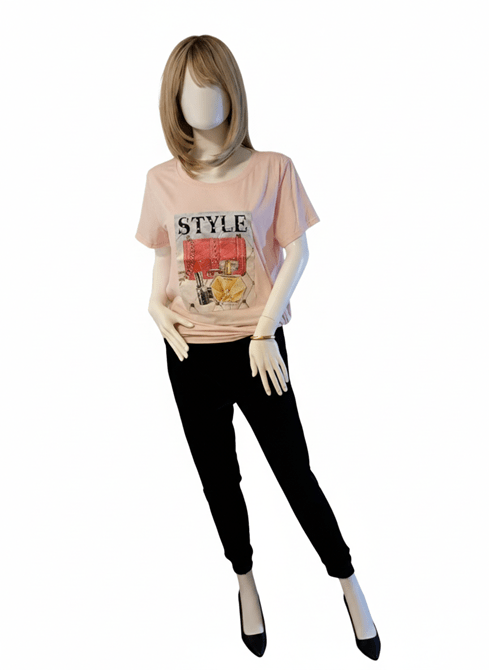
This pink t‑shirt immediately felt like Spring to me — soft, cheerful, and perfect for that in‑between season when we’re longing for sunshine, warmth, and the first fragrance of flowers. The cut is loose and not particularly flattering on its own, but the decorative panel on the front makes it special. The word STYLE is embellished with pearls, and the illustrated cosmetics below it sparkle with rhinestones. The panel’s deeper pink background adds dimension and contrast. I knew right away this was the uplifting piece I needed to bridge the time between February and April.

Layering soft pinks creates warmth and harmony, especially when textures play together.

My next step was choosing colors to complement the t‑shirt. I took my cue from the illustration: a dark navy lipstick tube stood out to me. With that in mind, I browsed the racks and found a pair of dark navy plus‑velvet sports slacks. They’re slim‑fitting with ankle cuffs, and the rich texture contrasts beautifully with the smooth t‑shirt. I planned to wear black pumps with this outfit — the black echoes the lettering on the shirt and keeps the attention where it belongs, without competing with the focal point.

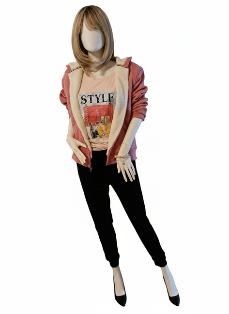
The finished outfit: coordinated colors, mixed textures, and a focal point that shines.

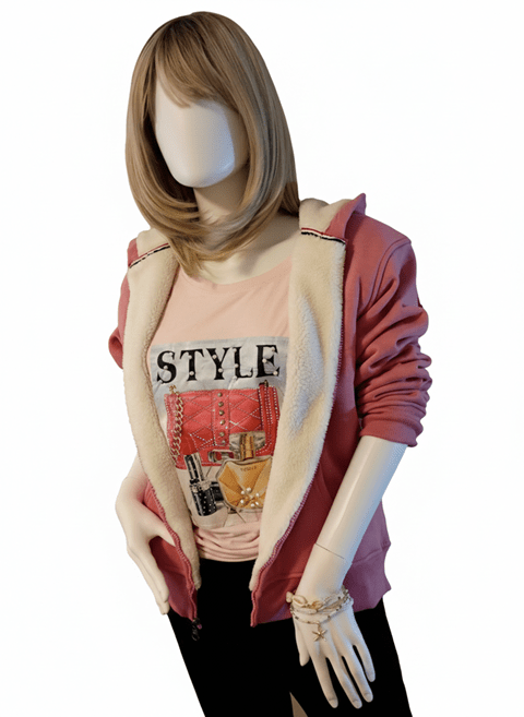
The final clothing piece was a sweater or hoodie. I chose a fleece‑lined hoodie in a deeper pink. Its shade is close enough to the darker pink in the t‑shirt’s panel to feel related, especially when paired with the white fleece lining. Whether worn open or slightly zipped, the lining softens the transition between the two pinks and helps the eye read them as a coordinated pair.

To finish the look, I gathered the t‑shirt at the side and tied a small knot. This adds shape, keeps the hem neat, and supports the overall silhouette. For accessories, I kept things simple. When wearing just the slacks and t‑shirt, a gold bangle complements the golden perfume bottle on the decorative panel. When the hoodie is added, stretch bracelets with white and gold beads tie in beautifully with the panel’s details and the hoodie’s lining.


Conclusion

By keeping the focal point in mind, I had a clear guide while shopping. The result is a coordinated outfit with room to grow as I add more tops or bottoms in similar tones and textures. The lesson here is that you don’t always need a plan before you shop. Start with the one striking piece that catches your eye. Then let color, texture, and your chosen focal point lead the way. From there, the outfit will naturally take shape.

Thank you for spending this styling moment with me — may your next “just‑because” purchase spark a little joy and guide you toward an outfit that feels beautifully, confidently you.

Style Tip: Let Your Focal Point Do the Talking

  • Start with one striking piece that lifts your mood.
  • Pull supporting colors from the details — even tiny ones count.
  • Mix textures to add richness without overwhelming the eye.
  • Keep accessories simple so your focal point stays center stage.
  • When in doubt, trust your instincts; harmony often begins with the piece you love most.

Disclosures

This post was drafted by me.
I collaborated with Microsoft Copilot to refine the text and tighten narrative flow.
I took the photos using the camera in my Cricket LG Phone.
Gemini and Nano Banana, accessed through Google Search, edited the photos by removing the backgrounds.

Easy elegance for styling in 2026

Katie’s personal style sense for 2026 is understated elegance. It includes a feeling for vintage while keeping her style sense modern.

Introduction

Happy New Year to all! I wish everyone success in their fashion related endeavors. I am still in the progress of refining my 1930s slopers and approach to inspirations routed in vintage aesthetics. I will be posting about the changes in my design approach once I have my new toiles and patterns ready for release to the commons. In this posting, I am sharing Katie’s New Year’s look.

Personal style approach for 2026

The key words for 2026 are personal style. Style is your own unique sensibility. You bring this to every outfit you coordinate and every wardrobe you curate. As we move into a New Year, I will be introducing the new elements that have enriched my personal approach to patternmaking, styling and the creation of vintage inspired looks for my patterns.

Katie’s New Year’s style is minimal. It is a look created for a professional business woman entertaining guests at home or attending a formal function for work. It is rich, yet understated. It is elegant, yet comfortable. Let’s breakdown the individual pieces in this outfit.

Elements of Katie’s New Year’s Look

Blouse: A simple scoop neck pull-over top with short sleeves begins the look. The understated champagne colored hue and silky surface set the tone for the other pieces. The blouse is made of a stretchy poly-silk fabric. It is unfitted and drapes beautifully. Katie wears a white camisole underneath for modesty and to maintain a professional appearance.

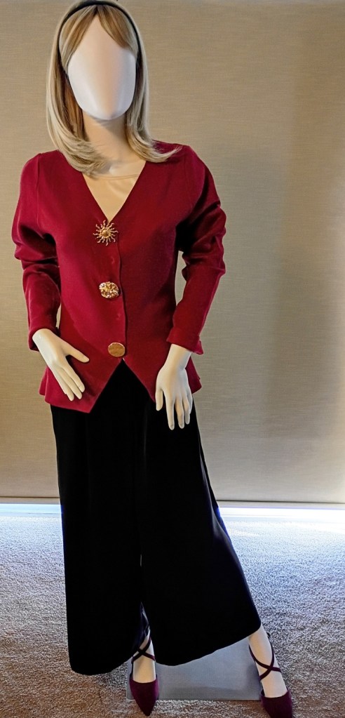
Sweater: The claret colored sweater is semi-fitted through tapering at the side seams. The slight flare at the hipline creates a dramatic flow that harmonizes with the black palazzo pants. The unbroken line creates a flattering silhouette. The sleeves of the sweater are intentionally longer. They can be pushed up or folded at the wrist to create different looks. I went for pushing the sleeves up to create a slightly casual feeling to the outfit. Katie is dressed up and relaxed about it.

The buttons on the sweater are not only a focal point. These large gold toned buttons make a statement about Katie’s values and her message for the New Year. The first button is a sunburst. This symbolizes the dawn of the New Year. The second button is unevenly textured. It looks like waves in the churning ocean. This can be seen as being receptive to intuitive and creative promptings. It signifies looking within for creative expression. The last button resembles a hammered surface. The slight indentations have not damaged the button’s appearance. Instead they lend interest to it. This can be viewed as acknowledging one’s shortcomings as well as one’s talents. Difficulties and shortcomings are always overcome when accepting the challenge. Working through a situation, and asking for help if needed, will bring a resolution. This is how Katie and I interpret the messages these buttons symbolize.

What makes the buttons so interesting is the Rule of Three. In visual marketing odd numbers attract more viewers than even numbers. This rule can be applied to a grouping of three mannequins, three accessories, the use of three different display stands of varying height and so on.

Slacks: The black palazzo pants offer an unexpected element of fluidity and flare to the outfit. They are more comfortable and gentle on the figure. This pair has pleats at the waist and pockets. The slacks rests on the natural waistline. It has belt loops for a 1″ belt. This makes more styling possibilities for future outfits featuring belts or sashes.

Shoes: Burgundy suede shoes with pointy toes and a 2″heel complete this elegant look. I intentionally chose burgundy so that the claret colored sweater retained interest. Burgundy brings the idea to a close and does so elegantly. The outfit is united in colors that work together, but not so coordinated as to be uninteresting.

My source of inspiration

I got the idea for the colors used while reading through a wine list at a holiday party. It was a delightful adventure shopping for these pieces based on the color palette. I never expected that. It proves that remaining open to those inner creative promptings will bring new and heightened sensitivities to color and coordination of outfit elements.

Note: I wrote this entire posting on my own. No AI has been used for refining of revising.
Photo: taken with my LG Android phone

Styling with Intention: Katie’s Executive Look and the 60-30-10 Rule in Motion


🍂Introduction

As we transition into fall, our wardrobes naturally shift toward deeper hues and richer neutrals. The 60-30-10 rule—often used in interior design—offers a helpful framework for styling: 60% dominant color, 30% secondary, and 10% accent. But in legacy curation and intuitive dressing, this rule is best held gently. It’s a guide, not a grid. And when the pieces come together through thoughtful collection rather than fast shopping, the final look sings with harmony and soul.

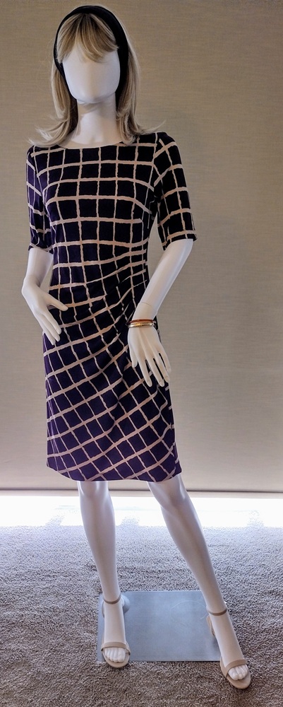
Katie’s outfit, styled for an Executive Office setting, is a masterclass in intentional wardrobe curation. None of the pieces were purchased together, yet they speak fluently in the same visual language—one of quiet sophistication, subtle pattern play, and emotionally resonant accents.

🖤 The Foundation: 60% Black-Navy Hue

Katie’s dress is the anchor of the look—a pull-over poly knit that requires no zippers, buttons, or pressing. It’s effortless yet refined, shaped by dart tucks on the left side seam that release fullness past the bust apex. These tucks send the skirt on the bias, transforming the lattice print from evenly spaced squares above the waist to elegant diamond shapes below. The fabric’s black-with-a-whisper-of-navy tone forms the dominant color, grounding the ensemble in a deep, seasonally appropriate neutral.

🤎 The Complement: 30% Tan Lattice

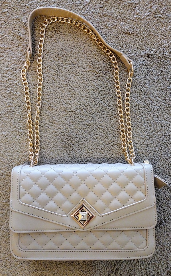
The tan lattice print is the secondary shade, adding warmth and visual interest. It’s not just a pattern—it’s a focal point. The geometric shift created by the bias cut adds movement and intrigue, making the dress feel both tailored and artistic. This tan tone is echoed in Katie’s quilted pocketbook and sandals—two pieces acquired at different times, yet perfectly matched in shade and spirit. The bag’s adjustable gold-tone chain and hardware elevate the look without overwhelming it.

✨ The Accent: 10% Gold and Amber

Accessories are minimal but meaningful. Katie wears two bracelets: a 14K gold bangle from my late mother, and a slim Russian amber bangle gifted by a cherished coworker. These pieces aren’t just adornments—they’re legacy touches, carrying emotional weight and subtle sparkle. They provide the perfect 10% contrast, adding warmth and depth to the darker palette.

🧥 The Layer: A Jacket with Quiet Authority

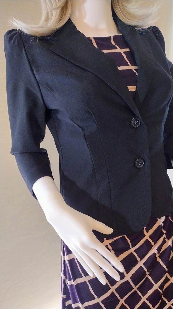
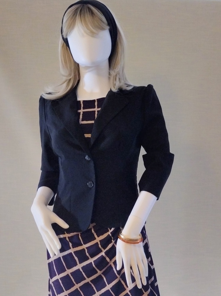
Over the dress, Katie wears a sculpted black jacket with a hint of navy. Though made from a different fabric than the dress, the dye lot differences are softened by the beige lattice print and the coordinating accessories. The jacket’s ¾ sleeves are gently gathered and puffed at the cap, offering structure without stiffness. It’s tailored yet comfortable—ideal for a professional setting where movement and presence matter.

The jacket achieves its flattering fit through thoughtful construction:

  • Princess seams run from the middle of the front armhole to the hemline, which stops at abdomen level.
  • A vertical dart in the side princess panel adds subtle shaping.
  • At the back, a center seam and vertical darts on either side contour the silhouette.
  • The wide lapel collar gives the illusion of shoulder pads, though the jacket is unlined, lightweight, and pad-free—proof that structure can be achieved without bulk.

🎀 The Finishing Touch

Katie completes her look with a simple black hairband—an understated detail that ties the ensemble together. And there she has it: an outfit created by shopping her closet, curated with care, and ready to take her from a day at the office to a casual dinner out.


🌿 Final Thoughts: Flexibility with Finesse

Katie’s look is a testament to the power of wardrobe curation. The 60-30-10 rule provided a starting point, but the final composition was guided by intuition, emotional resonance, and a deep understanding of color relationships. The result? A polished, professional outfit that feels cohesive, expressive, and entirely her own.

Whether you’re dressing for work, curating legacy offerings, or simply seeking harmony in your closet, let the rule guide you—but let your spirit lead.


Disclosure and Credits: This posting was researched and drafted by me. It was rewritten and condensed by Copilot for easier readability. All photos taken by me using the camera in my LG Android phone. Photos edited in the phone and in MS Paint.–EmilyAnn Frances May

Style Sense: Summer Chic in Antique Cream and Pink Roses

Introduction

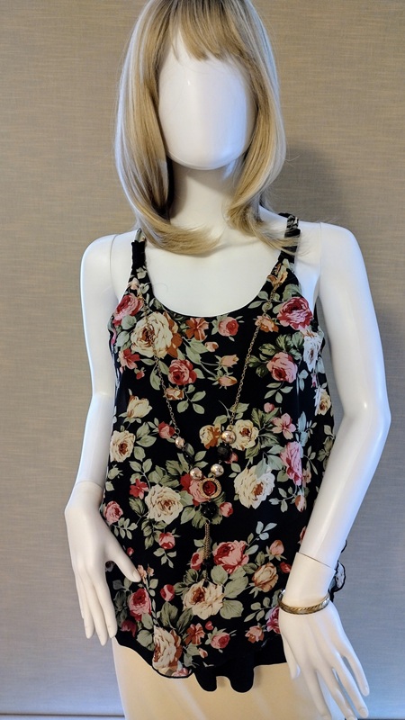
The styling exercise this week builds on the outfit featured in last week’s posting, Summer Chic: Vanilla Creme. The top is made from fabric featuring a pattern of roses against a black background. When the top of an outfit is a darker color than the bottom, consideration should be given about keeping all elements of the outfit in balance. I will share with you the decisions I made to keep the top as the focal point of this outfit.

Summer Chic: Antique Cream and Pink Roses

I wanted to draw the eye to the pretty floral print of the top and keep the focus there. The top has a necklace attached. It adds additional visual interest and focus. To draw the eye to the top it was important to use the tan colored sandals with the vanilla colored skirt. If black sandals were used to accessorize this outfit the eye would then move between the top and the sandals because of the strong difference to the lighter colors in the outfit.

I wanted the contrast between the top and the skirt to be effortless. The print fabric features roses in shades of antique cream and soft pink-red. The antique cream roses harmonize with the color of the skirt. Although this outfit looks like a set, it is not. The top was bought over 10 years ago! Since the top and skirt are basics and the colors classics the outfit works well for summer in any year. This is why I always encourage others to stay true to their style preferences and shop with timeless elegance and quality in mind.

Summary

To achieve balance between a dark colored top and a light colored bottom for an outfit:

–Keep the shoes and bottom garment the same or similar neutral hue.

–Select a color for the top that works in harmony with the netural hue. Make sure the color is not too strong. Otherwise the outfit will lack an element of balance.

–When the top is made of printed fabric find one color in the print that has is close to the neutral shade of the bottom.

I wanted the contrast between the top and the skirt to be effortless. The print fabric features roses in shades of antique cream and soft pink-red. The antique cream roses harmonize with the color of the skirt. Although this outfit looks like a set, it is not. The top was bought over 10 years ago! Since the top and skirt are basics and the colors classics the outfit works well for summer in any year. This is why I always encourage others to stay true to their style preferences and shop with timeless elegance and quality in mind.

Summary

To achieve balance between a dark colored top and a light colored bottom for an outfit:

–Keep the shoes and bottom garment the same or similar neutral hue.

–Select a color for the top that works in harmony with the netural hue. Make sure the color is not too strong. Otherwise the outfit will lack an element of balance.

–When the top is made of printed fabric find one color in the print that has is close to the neutral shade of the bottom.

Combining Minimalism and Vintage to Style a LBD

Introduction

For this styling exercise I wanted to apply the principles of Minumalism. Here are a few key elements of Minamulism in design and styling:

* Clothing is well fitting.
* Neutral shades predominate.
* Classic styling with minimal details.
* High quality fabrics and notions.
* Form follows function. There must be a purpose to every part of the garment. This results in fewer frills and non-essential details.
* Accessories must be carefully chosen and contribute to a refined look.

I started with my favorite Little Black Dress (LBD).

LBD Details

I bought this LBD at a small boutique on Fifth Avenue in Bay Ridge, Brooklyn. A sewista with mid-level skills will be able to analyze the style lines and understand how the fit is achieved. This LBD skims the body but is not form fitting. Fit is achieved through vertical princess seaming from shoulder to hem on each side of center front and center back. The princess seams intersect with the bust dart and vertical dart on the front of the basic sheath dress pattern. They also go through where the shoulder dart and vertical dart on the back basic pattern are.

There are two layers to the butterfly sleeves. Each layer is lined with a lightweight black satin. The dress is also lined with the same material. This helps the dress fit smoothly over the body. My challenge was to find one accessory that adds visual interest and works as a definitive focal point for the outfit. Determing the focal point is a skill developed through practice. My ability in this area is still developing.

The Focal Point for the LBD

I decided there could be two different focal points. Which one I would apply depended on the occassion.
Styling #1

The fluttery butterfly sleeves reminded me of similar sleeves on dresses and blouses of the 1930s. I wanted to add a combination of retro Art Deco and Modern Minimalism in the choice of the accessory to define the focal point.

I selected a wide elastic band belt with a triangular mock Marcasite belt. The sparkling belt buckle creates a striking contrast against the black dress. The width of the belt works well to create a more fitted look. The width of the belt is just right since it keeps the eye focused on the waist area. This is where I wanted the focal point to be.

Styling #2

For a different look, I removed the belt and considered accessories that create a different impact and vocal point. These accessories provide some interest but keep the eye focused on the fit and flow of the LBD. I chose costume jewelry in the form of a mock cubic zirconia ring set. The purse has a mock marcasite closure that also carries a little feeling of Art Deco. It may be used as a clutch. It also comes with silver chains with clasps that connect with loops that swivel up from the inside of the purse. For a little added sophistication, a silvery rhinestone perfume atomizer or lipstick case can add further interest to the purse as a focal point.

Conclusion

It is possible to combine the principles of timelessness and simplicity of Minimalism with one or two elements of vintage fashion. Practice and experimentation will help develop the sensibilities needed.

The Value of Styling and Visual Merchandising for Dressmakers

Have you ever wondered how you can sharpen your style sense and design vision? Developing your style sense is a path of continual improvement. How does a sewist or sewista practice color coordination and accessorizing? I asked myself these questions a few months ago. This is why I bought a mannequin. I named her Katie and she serves as a model and advisor. It is one thing to envision an outfit I will make or coordinate from clothing I purchased. It is another experience to see that outfit on a mannequin.

A mannequin can be another you, your muse or the customer you target for your creations. The mannequin enables you to step back and behold the impact of the outfit. In this sense, you can experience the outfit and the impression it makes. This experience takes place in real time, whenever you walk into the room and see the mannequin. It is more immediate and vivid that reviewing selfies, or photos others have taken of you in the outfit. The mannequin lets you experience the outfit in real time.

I am styling outfits for Katie from the clothing I already have. For this posting I created a casual back-to-the office look using separates. I did not buy any of the pieces at the same time. My preference for certain colors made the coordination of this outfit possible. Choosing a basic black mini-skirt and pumps also made the outfit come together. I would recommend a similar approach if you decide to start styling outfits on a mannequin. Choose one piece in black, white, navy blue, grey, or brown. Then pair it with a piece in a complementary color or print.

Sharing photos of your styled look will help you get feedback.. There is an excitement to discussing a new outfit and consulting with others what will round it out. In the process you will be interacting with others in a way that design team members do. Everyone will see the outfit in a different way. Some will suggest you add an element, and some may critique it. It is important to accept the feedback with grace and use it as a means to grow your style sense and design skills.