Styling with Intention: Katie’s Executive Look and the 60-30-10 Rule in Motion


🍂Introduction

As we transition into fall, our wardrobes naturally shift toward deeper hues and richer neutrals. The 60-30-10 rule—often used in interior design—offers a helpful framework for styling: 60% dominant color, 30% secondary, and 10% accent. But in legacy curation and intuitive dressing, this rule is best held gently. It’s a guide, not a grid. And when the pieces come together through thoughtful collection rather than fast shopping, the final look sings with harmony and soul.

Katie’s outfit, styled for an Executive Office setting, is a masterclass in intentional wardrobe curation. None of the pieces were purchased together, yet they speak fluently in the same visual language—one of quiet sophistication, subtle pattern play, and emotionally resonant accents.

🖤 The Foundation: 60% Black-Navy Hue

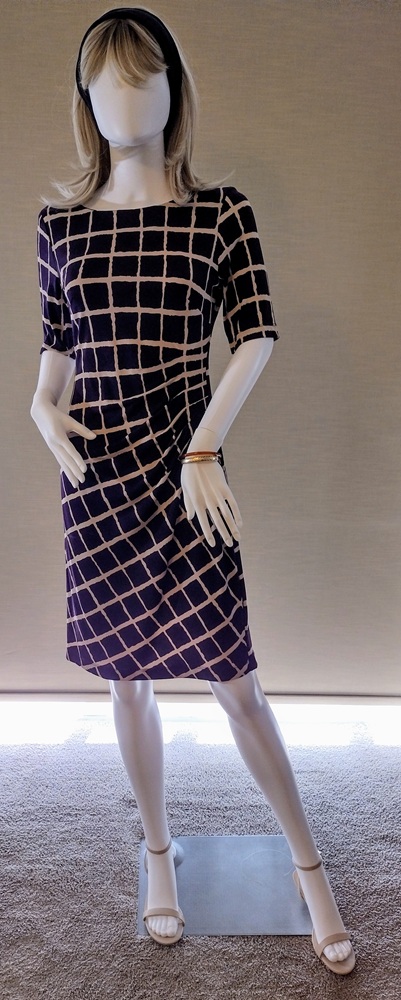
Katie’s dress is the anchor of the look—a pull-over poly knit that requires no zippers, buttons, or pressing. It’s effortless yet refined, shaped by dart tucks on the left side seam that release fullness past the bust apex. These tucks send the skirt on the bias, transforming the lattice print from evenly spaced squares above the waist to elegant diamond shapes below. The fabric’s black-with-a-whisper-of-navy tone forms the dominant color, grounding the ensemble in a deep, seasonally appropriate neutral.

🤎 The Complement: 30% Tan Lattice

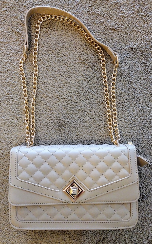
The tan lattice print is the secondary shade, adding warmth and visual interest. It’s not just a pattern—it’s a focal point. The geometric shift created by the bias cut adds movement and intrigue, making the dress feel both tailored and artistic. This tan tone is echoed in Katie’s quilted pocketbook and sandals—two pieces acquired at different times, yet perfectly matched in shade and spirit. The bag’s adjustable gold-tone chain and hardware elevate the look without overwhelming it.

✨ The Accent: 10% Gold and Amber

Accessories are minimal but meaningful. Katie wears two bracelets: a 14K gold bangle from my late mother, and a slim Russian amber bangle gifted by a cherished coworker. These pieces aren’t just adornments—they’re legacy touches, carrying emotional weight and subtle sparkle. They provide the perfect 10% contrast, adding warmth and depth to the darker palette.

🧥 The Layer: A Jacket with Quiet Authority

Over the dress, Katie wears a sculpted black jacket with a hint of navy. Though made from a different fabric than the dress, the dye lot differences are softened by the beige lattice print and the coordinating accessories. The jacket’s ¾ sleeves are gently gathered and puffed at the cap, offering structure without stiffness. It’s tailored yet comfortable—ideal for a professional setting where movement and presence matter.

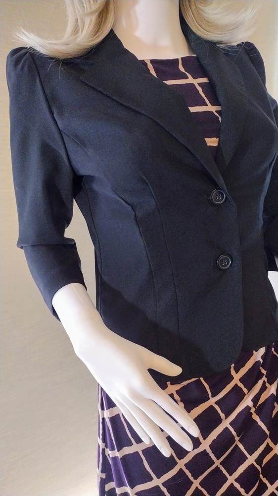
The jacket achieves its flattering fit through thoughtful construction:

  • Princess seams run from the middle of the front armhole to the hemline, which stops at abdomen level.
  • A vertical dart in the side princess panel adds subtle shaping.
  • At the back, a center seam and vertical darts on either side contour the silhouette.
  • The wide lapel collar gives the illusion of shoulder pads, though the jacket is unlined, lightweight, and pad-free—proof that structure can be achieved without bulk.

🎀 The Finishing Touch

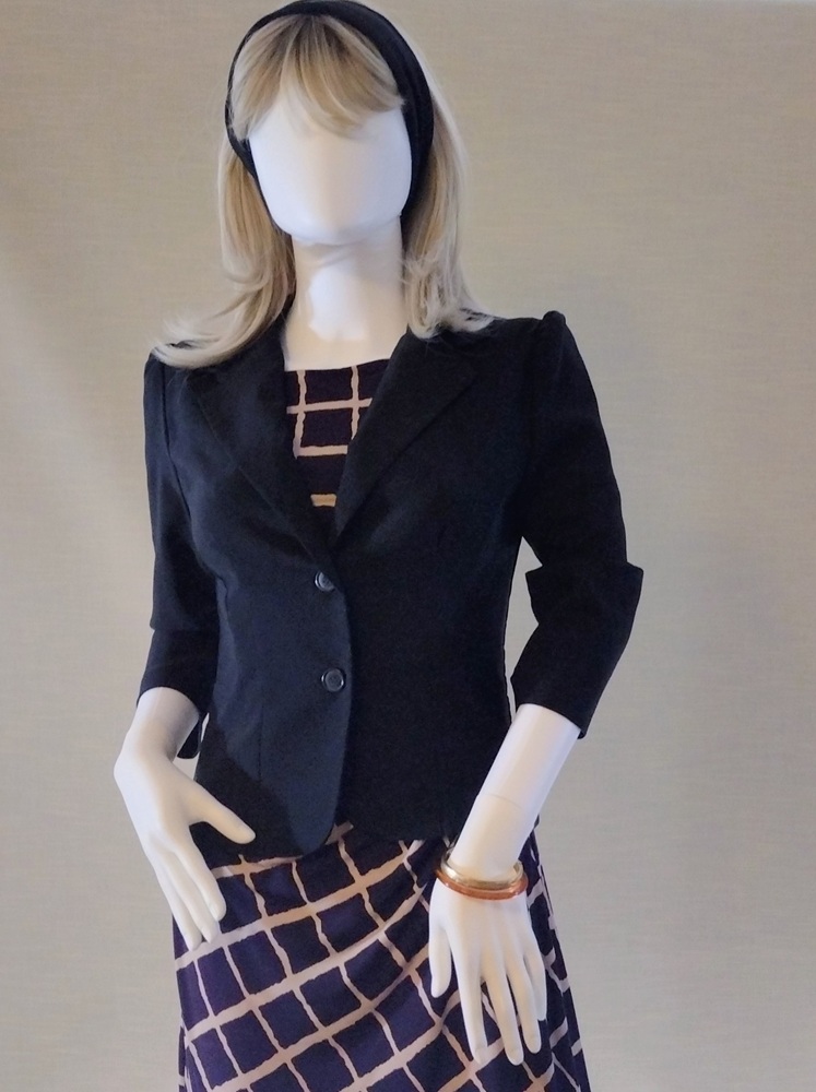
Katie completes her look with a simple black hairband—an understated detail that ties the ensemble together. And there she has it: an outfit created by shopping her closet, curated with care, and ready to take her from a day at the office to a casual dinner out.


🌿 Final Thoughts: Flexibility with Finesse

Katie’s look is a testament to the power of wardrobe curation. The 60-30-10 rule provided a starting point, but the final composition was guided by intuition, emotional resonance, and a deep understanding of color relationships. The result? A polished, professional outfit that feels cohesive, expressive, and entirely her own.

Whether you’re dressing for work, curating legacy offerings, or simply seeking harmony in your closet, let the rule guide you—but let your spirit lead.


Disclosure and Credits: This posting was researched and drafted by me. It was rewritten and condensed by Copilot for easier readability. All photos taken by me using the camera in my LG Android phone. Photos edited in the phone and in MS Paint.–EmilyAnn Frances May

Style Sense: Your Chic Superpower

Meet Katie—my ever-patient mannequin and today’s muse. I’ve styled in a look for her that’s quietly elegant, budget-friendly, and built entirely from my own closet. No splurges, no fast fashion—just timeless pieces collected over time, chosen with care and worn with confidence.

Katie wears:

  • A cream pencil skirt in a classic cut—versatile, flattering, and ready to star in future posts.
  • A linen-blend blouse with cream, gold, and tan stripes that echo her neutral palette.
  • Beige sandals and a gold fabric hairband for understated polish.
  • Four beaded bracelets in soft cantaloupe, white, beige, tan, and gold—just enough sparkle to say “I’m here.”

The magic? These pieces weren’t bought as a set. They came from different seasons, different shops, and different moods. But they work—because I stayed true to my style sense: flattering lines, neutral shades, and colors that make me feel like me.

This is your reminder:
–You don’t need a new wardrobe. You need your style sense.
–Shop your closet. Trust your eye. Build slowly. Choose what flatters and feels good. Chic isn’t about cost—it’s about coherence, confidence, and care.

You’re already stylish. Let’s keep building on that.

Disclosure and Credits: This posting was researched and drafted by me. It was rewritten and condensed by Copilot for easier readability. All photos taken by me using the camera in my LG Android phone. Photos edited in the phone and in MS Paint.–EmilyAnn Frances May

Style lines from a vintage patternmaking handout

In my previous posting, “What are style lines?” I explained what style lines are. I showed how a few style lines can be used to transform a basic skirt and bodice into a vintage inspired fashion from a 1964 magazine photograph.

Today, I’m sharing classroom handouts from a vintage patternmaking book. The style lines used are easy to understand and clearly illustrated on the basic bodice. Based on my knowledge of patternmaking it looks like the “slash and spread” method was used. This means, the pattern was created by tracing the basic sloper. The style lines were then drawn. After that, the pattern was slashed and spread when tucks or gathers had to be created. Other patterns were simply cut along the style lines, like the one for the princess line bodice.

I estimate that these pattern transformations are from the 1940s.

What are style lines?

Introduction

The basic pattern, a/k/a sloper, is the blueprint of a person’s body. It is a one dimensional representation of the measurements of the body used within a pattern drafting system. Or, the dress form itself is the basic pattern in three dimensional form. It represents the standard size or the size of the person for whom it was custom made.

The process of working the basic pattern into an individual style is called pattern transformation. Style lines are used to map out how the emerging style will look. They are drawn onto the basic pattern. Alternately, style tape is pinned to the dress form to show how the garment pieces will look. This helps the draper know where to mold the fabric and how the garment piece should look.

Analyzing an outfit and seeing the style lines

A knowledge of the different forms sleeves, bodices, skirts, collars, pants and dresses can take helps in analyzing an existing style. Rough sketches help clarify if one is seeing the style lines correctly or misinterpreting a photograph or sketch someone else has made. Of course the best way to analyze a garment is to see it in real time. That is not always, possible, though. When one is inspired by a vintage style sketching and studying photos is one way to help in the recreation or updated expression of that style.

An economical way to practice visualizing and understanding stylelines is to have a library of basic bodices, sleeves, skirts and slacks printed on 8 1/2 x 11 paper. With colored pencil or pen these copies can have style lines drawn over them. Immediately you can see the blueprint for the pattern transformation. Which darts and seams the style lines intersect with also comes to the fore. It is possible to get a better idea what needs to be done for the actual transformation.

Example of a style analysis and practice transformation

This photo comes from a 1964 edition of the Saturday Evening Post. Fashions from Hong Kong were featured. This cocktail outfit consists of a silk sheath shirt and unfitted, sleeveless blouse.

On copies of a basic bodice and basic skirt, fronts and backs, style lines are sketched and notes added to better understand one possible way to recreate, or at least interpret, the original 1964 fashion.

I hope these suggestions help you in your next vintage inspired style recreation or adaptation.